
How to Create Beautiful Website Layouts That Feel Professional
12 MIN READ
Learn the design principles behind polished website layouts that feel balanced, intentional, and easy to explore—without looking like a template.
A beautiful website isn’t created by accident.
It’s the result of thoughtful decisions about spacing, balance, visual hierarchy, photography, typography, and the way each section flows into the next. Many people assume professional websites are built with complicated design techniques or expensive custom development, but in reality, the difference usually comes down to layout.
When your content is organized well, visitors naturally know where to look next. The page feels easier to read, more enjoyable to explore, and ultimately more trustworthy.
The good news is that creating better layouts isn’t about following one exact template. It’s about understanding a handful of design principles you can use on every page of your website. In this article, you’ll learn how to create layouts that feel polished, balanced, and intentionally designed—regardless of your niche.
In This Article
01 Start Every Page with One Clear Focal Point
02 Build a Natural Flow Between Sections
03 Balance Text, Images, and White Space
04 Create Visual Rhythm Instead of Repetition
05 Give Every Section a Purpose
06 Design for Mobile from the Beginning
07 Common Website Layout Mistakes to Avoid
08 Bringing Everything Together
01. Start Every Page with One Clear Focal Point
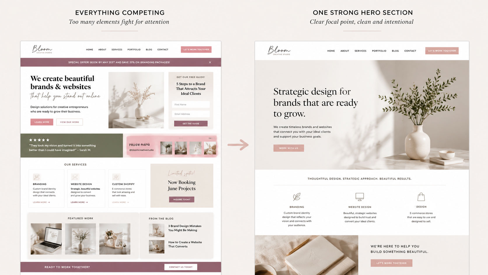
One of the quickest ways to make a website feel overwhelming is trying to show everything at once.
A professional layout always answers one question immediately:
What should visitors notice first?
Whether it’s a headline, photograph, featured product, or call to action, every page should begin with a clear visual focal point. When everything competes for attention, nothing stands out.
Good layouts create hierarchy before visitors even begin reading, making it immediately clear where visitors should focus first.
02. Build a Natural Flow Between Sections
Think of your website like telling a story.
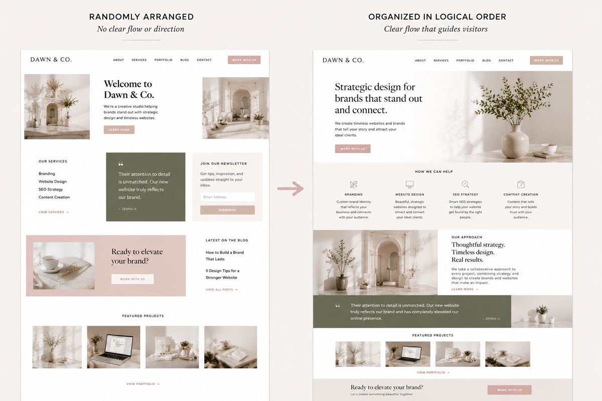
Each section should naturally lead into the next instead of feeling like disconnected blocks stacked on a page. Rather than thinking about individual sections, think about how they work together to guide visitors through your content.
As you build each page, ask yourself:
What question does this section answer?
What should visitors want to know next?
Instead of randomly arranging content, create a logical progression that naturally moves visitors from one idea to the next.
A typical reading path looks like this:
Hero
↓
Introduction
↓
Services
↓
Testimonials
↓
FAQ’s
↓
Final call to action
When content flows logically, visitors don’t have to work to understand your website. Instead, the experience feels intuitive, making every section easier to read and every next step feel natural.
03. Balance Text, Images, and White Space
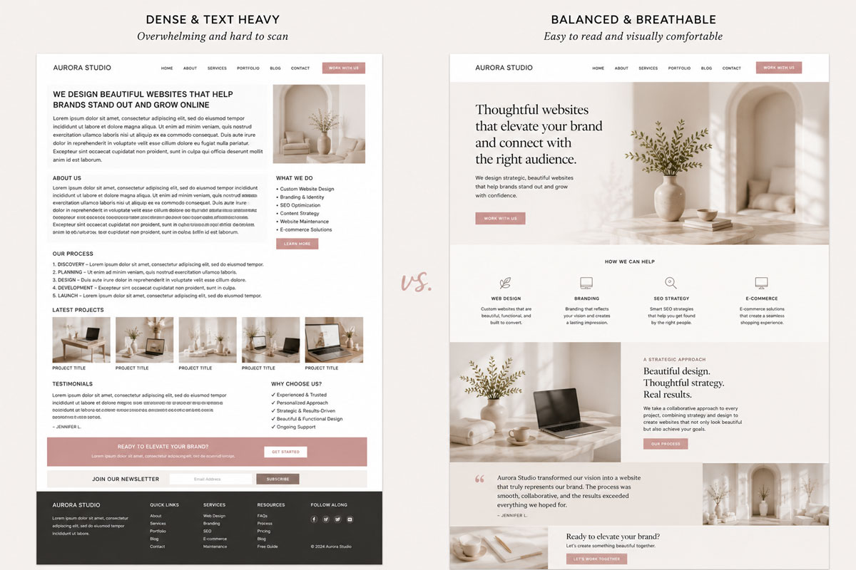
Professional layouts rarely rely on large walls of text. Instead, they balance written content with imagery and generous spacing, creating breathing room while making information easier to absorb.
If one section feels heavy with text, consider introducing:
These visual elements help break up long sections, improve readability, and keep visitors engaged as they move down the page.
Likewise, avoid filling every empty space simply because it’s available. White space isn’t wasted space—it’s what allows your most important content to stand out.
04. Create Visual Rhythm Instead of Repetition
One of the biggest signs of a beginner website is repeating the exact same layout over and over.
Imagine a page where every section follows the same pattern:
Image left.
Text right.
Repeat.
Repeat.
Repeat.
While consistency is important, too much repetition can make a page feel predictable. Professional websites create visual rhythm by introducing subtle variation while maintaining a cohesive overall design.
Instead of repeating the same layout throughout the page, try:
These small changes create movement that keeps visitors engaged without making the page feel inconsistent.
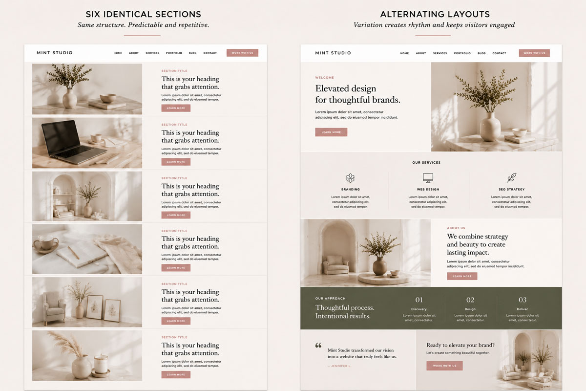
Beautiful layouts aren’t repetitive—they create rhythm.
05. Give Every Section a Purpose
Before adding another section, ask yourself one simple question:
Does this help visitors make a decision?
Every section on your website should have a clear job. Whether it’s introducing your business, explaining your services, answering common questions, building trust, showcasing results, or encouraging visitors to take the next step, each section should move your audience closer to their goal.
If a section doesn’t accomplish something meaningful, it may not belong on the page. Professional layouts feel intentional because every element earns its place.

Designer Tip:
Think in conversations, not sections. Each part of your page should answer the question visitors are most likely asking next. When your content flows like a conversation, your layouts become easier to understand, more engaging to explore, and more likely to guide visitors toward action.
06. Design for Mobile from the Beginning
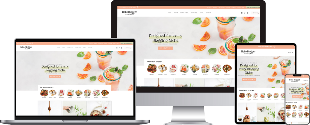
Nearly every layout decision should consider smaller screens. A beautiful desktop design doesn’t always translate well to mobile, so it’s important to think about every device from the beginning rather than treating mobile as an afterthought.
As you build pages, regularly check:
Designing with mobile in mind from the start creates a more consistent experience across every screen size and helps ensure visitors enjoy your website no matter how they access it.
07. Common Website Layout Mistakes to Avoid
Even small layout decisions can make a website feel cluttered. Some of the most common mistakes include:
The good news is that improving a layout usually isn’t about adding something new. More often, it’s about simplifying what’s already there and giving your most important content room to shine.
08. Bringing Everything Together
Beautiful layouts aren’t created by copying someone else’s homepage. They’re built by combining thoughtful spacing, clear hierarchy, balanced imagery, consistent styling, and intentional flow.
As you continue improving your website, remember that every page is an opportunity to guide visitors naturally from one idea to the next. When your layouts feel organized and purposeful, your entire website becomes easier to navigate, more enjoyable to explore, and far more memorable.
Designer Tip:
The best layouts often feel effortless—not because they were easy to create, but because every decision was made with intention.
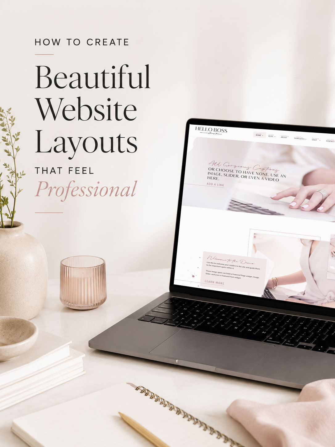
Create Beautiful Layouts Without Starting from Scratch
Every Hello You Designs theme is built around the same layout principles covered throughout this article—from balanced spacing and clear visual hierarchy to flexible page sections that are easy to customize.
Explore our collection of WordPress themes and create a website that feels polished, professional, and uniquely yours.
Some Common Design Questions
Still have questions? Here are a few quick answers to some of the most common questions about this topic.