
How to Choose the Right Images for Your Website
10 MIN READ
The right images don’t just fill empty space—they tell your story, strengthen your brand, and help visitors connect with your website before they read a single word.
Visitors notice your images before they read a single word.
Photography sets the tone for your entire website. It can make your brand feel polished and professional, warm and welcoming—or inconsistent and unfinished. Even with thoughtful typography, beautiful colors, and clean layouts, mismatched or low-quality images can make a website feel disconnected.
The good news is that choosing better website images isn’t about having an expensive photoshoot. It’s about understanding how images work together to support your content and reinforce your brand.
In this article, you’ll learn how to choose website images that feel cohesive, guide your visitors’ attention, and create a stronger first impression.
In This Article
01 Images Shape First Impressions
02 Build a Consistent Visual Style
03 Choose Images That Support Your Content
04 Think About Composition, Not Just the Subject
05 Use Images to Guide Attention
06 Choose the Right Image Dimensions
07 Common Website Image Mistakes to Avoid
08 Bringing Everything Together
01. Images Shape First Impressions
Before visitors read your first sentence, they’ve already started forming an opinion about your website.
Photography communicates mood, quality, and personality almost instantly. Bright, airy images create a different feeling than dark, dramatic photography. Editorial photography tells a different story than generic stock photos. Every image contributes to how visitors perceive your brand.
That’s why images should never feel like an afterthought. They’re one of the strongest visual tools you have.
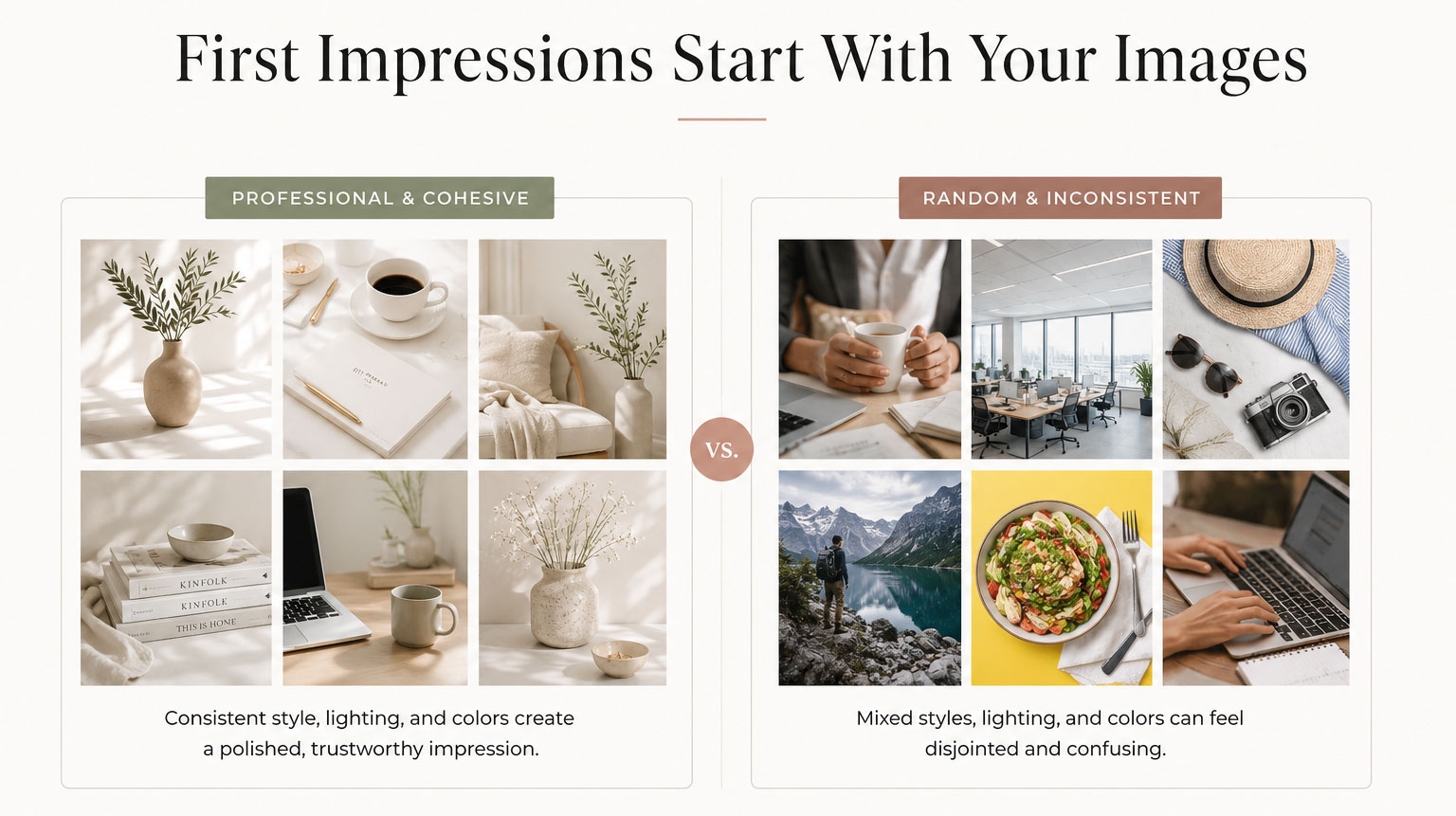
Visitors see your images before they read your words.
02. Build a Consistent Visual Style
Your website shouldn’t feel like every image came from a different photographer. Consistency creates trust.
Think about the overall feeling you want your brand to communicate—whether that’s bright and airy, warm and inviting, bold and modern, or minimal and refined.
Once you’ve established that direction, choose images that share similar lighting, color tones, editing style, and composition.
Your website immediately feels more polished when every image belongs to the same visual story.
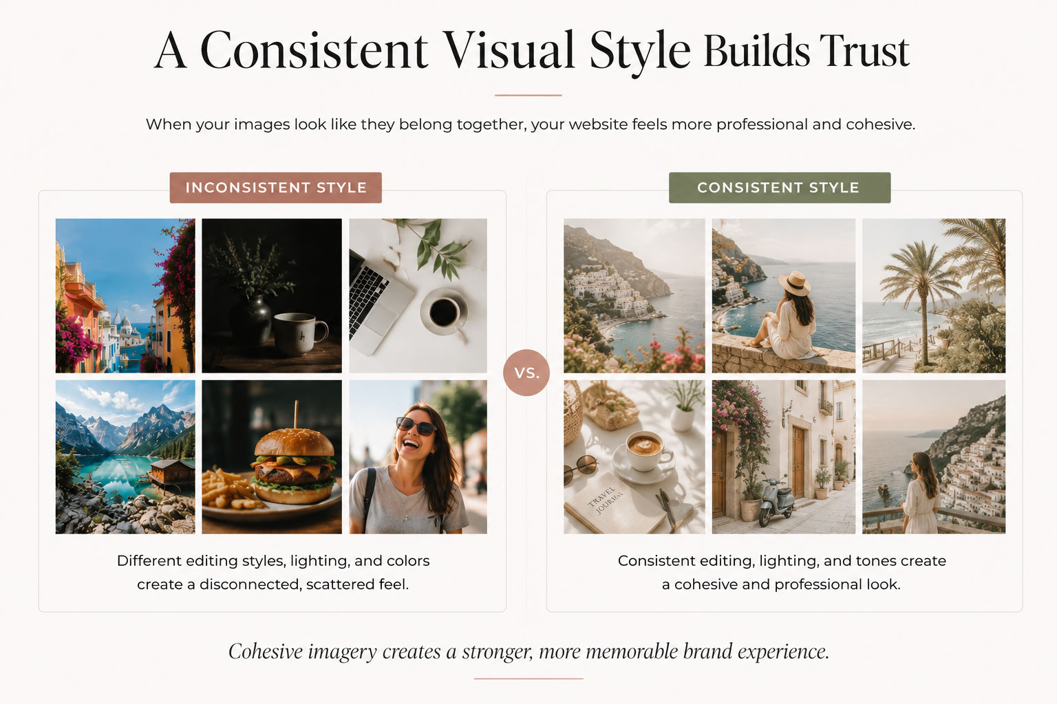

Designer Tip:
Choose a visual style first. Individual photos become much easier to select afterward.
03. Choose Images That Support Your Content
Beautiful photography isn’t always the right photography.
Every image should reinforce the message you’re trying to communicate.
Match your photography to your topic. If you’re writing about website design, show design work. If you’re explaining branding, include branding examples. If you’re discussing blogging, show real blogging environments.
Images shouldn’t distract from your content—they should make it easier to understand.
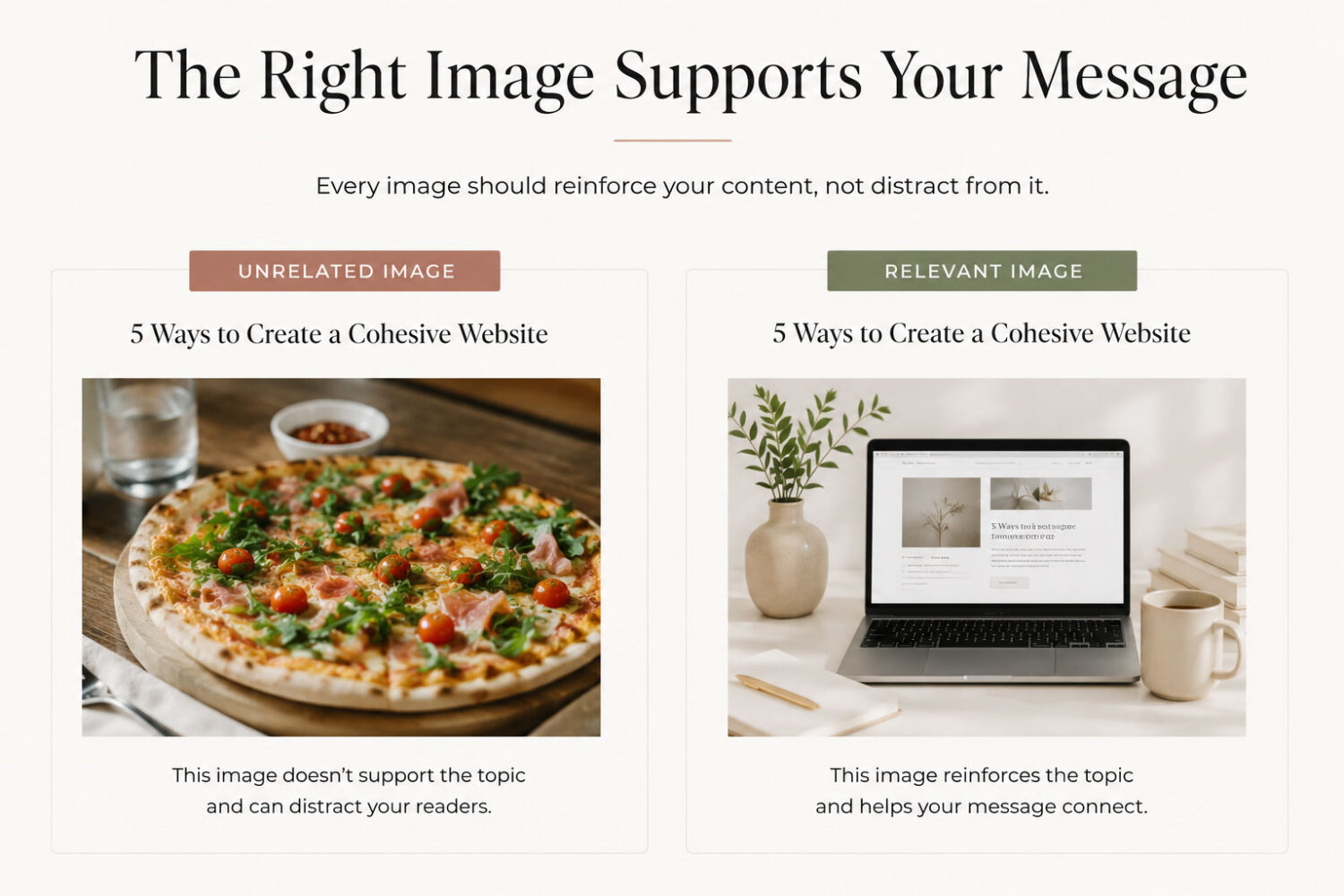
Great images don’t compete with your content—they strengthen it.
04. Think About Composition, Not Just the Subject
It’s easy to focus on what is in an image.
It’s just as important to think about how it’s photographed.
Choose images with room for text, clear focal points, balanced negative space, and a natural visual flow. These details make layouts feel more intentional and much easier to design around.
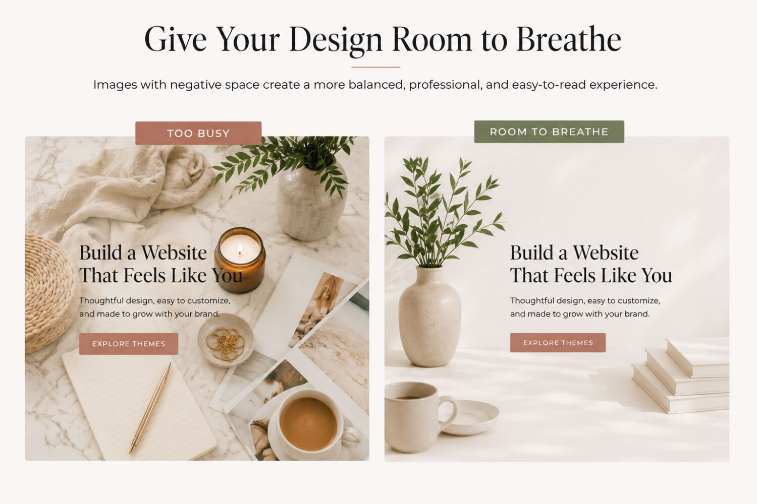

Design Insight:
The best website images leave room for your design—not just the subject.
05. Use Images to Guide Attention
Images can quietly direct where visitors look.
Whether it’s a person looking toward your headline, a product angled toward a call to action, or leading lines that naturally guide the eye, photography can reinforce your layout instead of competing with it. Used intentionally, images become another tool for visual hierarchy rather than simple decoration.
Designer Tip:
Ask yourself: “Where does this image encourage visitors to look next?“
06. Choose the Right Image Dimensions
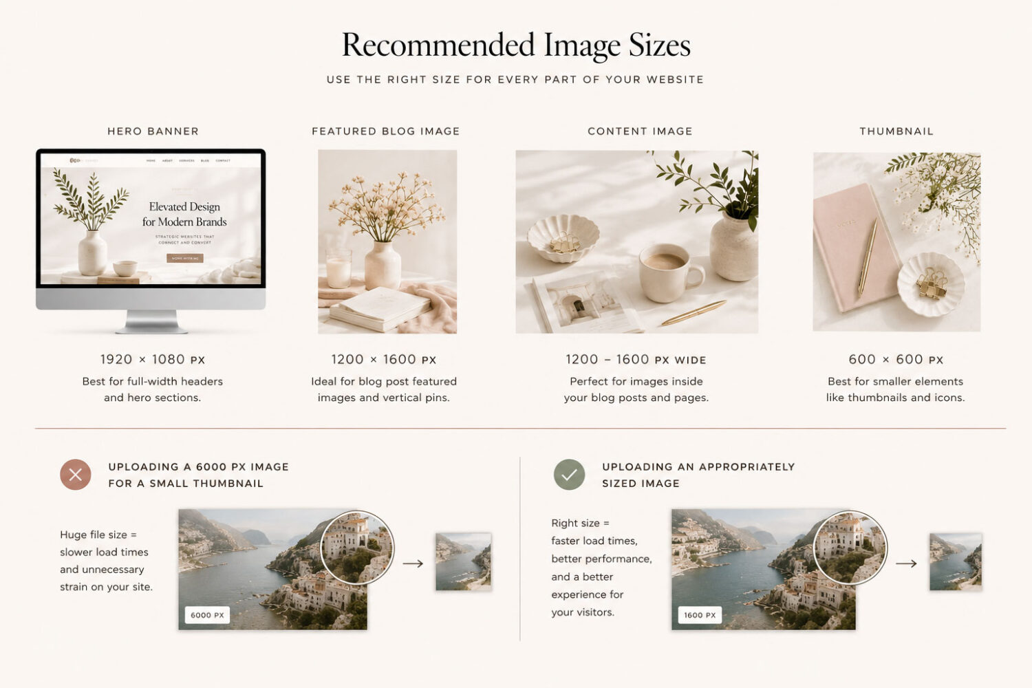
One of the most common website image mistakes isn’t choosing the wrong photo—it’s uploading the wrong size.
Large images slow down your website, while images that are too small can look blurry on larger screens. The goal is to upload images that are appropriately sized for where they’ll actually appear.
A full-width hero image needs much more space than a blog thumbnail or author photo. Choosing the correct dimensions helps your website load faster while keeping everything looking crisp and professional.
Before uploading an image, ask yourself:
Designer Tip:
Upload images only as large as they need to be. Bigger files don’t always create better-looking websites—they usually create slower ones.
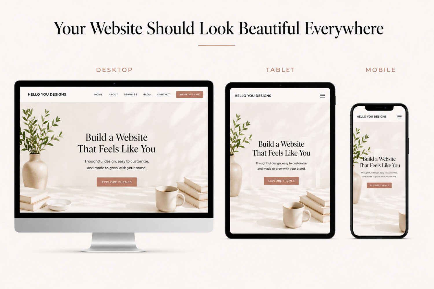
Optimize Images for Every Screen
An image that looks beautiful on a desktop can feel cramped on a phone.
Review how images crop across different screen sizes. Make sure important subjects stay visible, text overlays remain readable, and focal points aren’t cut off.
Optimizing for mobile isn’t just about file size—it’s about preserving the experience.
Some website builders also let you assign different images for desktop, tablet, and mobile (like the Kadence Framework). This can be helpful when a wide desktop image doesn’t crop well on smaller screens, allowing each visitor to see the version that’s best suited to their device.
07. Common Website Image Mistakes to Avoid
Even beautiful photography can weaken a website when it’s used inconsistently.
Some of the most common mistakes include mixing editing styles, stretching images, uploading low-resolution files, overcrowding pages with too many photos, or relying on generic stock photography that doesn’t reflect your brand.
None of these issues are difficult to fix on their own, but together they can make an otherwise well-designed website feel less polished. Paying attention to these small details helps create a more cohesive, professional experience.

Quick Check:
Before publishing your website, ask yourself:
08. Bringing Everything Together
Photography is one of the first things visitors notice—and one of the last things they consciously think about.
When your images feel consistent, purposeful, and thoughtfully chosen, your website becomes more engaging, memorable, and trustworthy.
Like typography, color, white space, and navigation, great imagery isn’t about adding more—it’s about choosing better.
Great website images don’t compete for attention—they quietly strengthen everything around them.
Beautiful websites begin with thoughtful design, and the right imagery brings that design to life.
Every Hello You Designs theme is designed to showcase photography beautifully, making it easy to create a website that feels polished, cohesive, and uniquely yours.
Some Common Design Questions
Still have questions? Here are a few quick answers to some of the most common questions about this topic.