
How to Create a Cohesive Website That Feels Professionally Designed
12 MIN READ
Small design decisions repeated consistently create a website that feels polished, intentional, and unmistakably yours.
One of the easiest ways to tell whether a website was thoughtfully designed isn’t the logo, photography, or even the colors.
It’s consistency.
Professional websites feel intentional because every page follows the same visual language. Headings look familiar. Buttons behave the same way. Spacing feels predictable. Colors appear with purpose instead of randomly.
Visitors rarely notice these details individually—but they absolutely notice the overall feeling they create.
When every design decision works together, your website becomes easier to navigate, easier to trust, and much more memorable.
In this guide, we’ll explore ten ways to create a website that feels cohesive from the first page to the last.
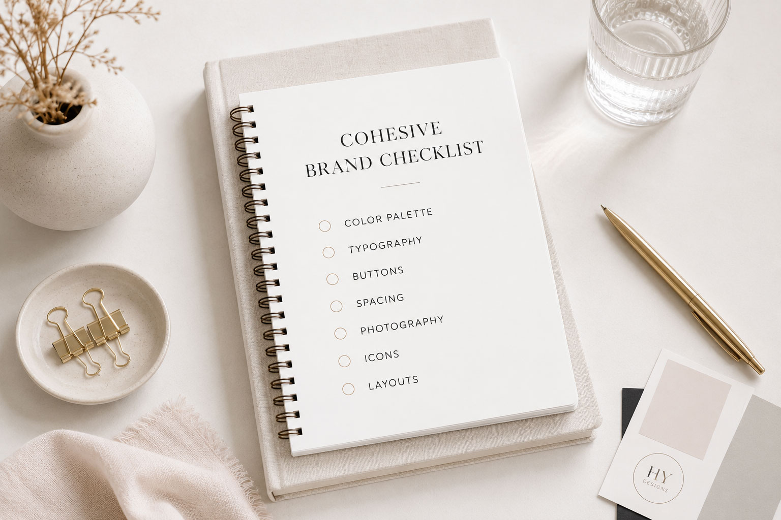
In This Article
01 Build a Design System
02 Use Consistent Typography
03 Repeat Your Colors Intentionally
04 Create Predictable Layouts
05 Keep Buttons Consistent
06 Develop a Photography Style
07 Use White Space Consistently
08 Create Visual Hierarchy
09 Maintain Consistency Across Every Page
10 Let Your Brand Become Recognizable
01. Build a Design System
The best websites aren’t designed page by page. They’re designed system by system. Before creating individual pages, decide how your website will consistently use colors, typography, buttons, spacing, icons, and photography.
Instead of asking,
“What should this page look like?”
ask,
“How does this page fit into the rest of my website?”
That small shift changes everything.
A cohesive website always starts with a clear brand identity. If you’re still defining what makes your website feel uniquely yours, read Your Website Should Feel Like Your Brand, Not Just Another Template.
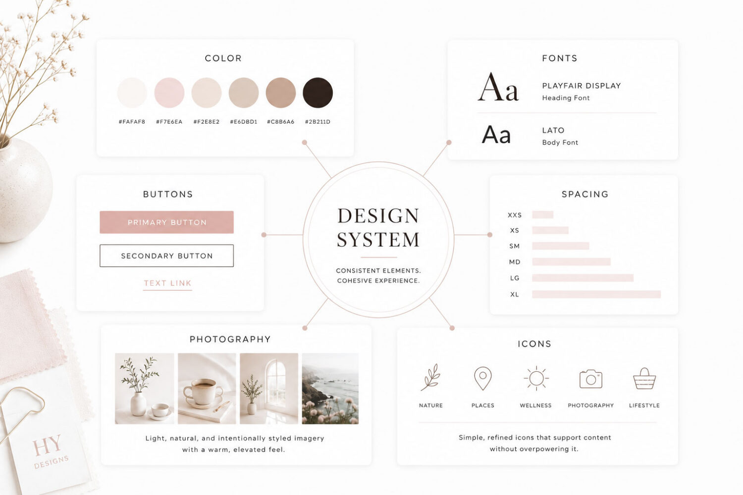
Great design isn’t about creating something different on every page.
It’s about creating something familiar.

Designer Tip:
Create your design rules once, then reuse them everywhere. Consistency is much easier than constantly redesigning.
02. Use Consistent Typography
One of the quickest ways a website feels unprofessional is when every page uses typography differently.
Headings shouldn’t constantly change sizes. Body text shouldn’t suddenly become centered, and button fonts shouldn’t change from page to page.
The best websites establish clear typography rules and use them consistently across every page. Readers quickly become familiar with your content, making it easier to navigate and more enjoyable to read.
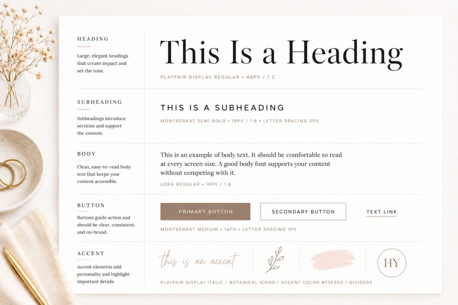
Readers shouldn’t have to relearn your website every time they visit a new page.
03. Repeat Your Colors Intentionally
Strong brands don’t use more colors—they use the same colors more consistently.
Accent colors should appear repeatedly throughout your website. Buttons should remain recognizable, and background colors should help define sections without competing for attention.
When the same color palette appears with purpose across every page, your website begins to feel more intentional, polished, and recognizable. Visitors may not consciously notice the repetition, but they will notice how cohesive everything feels.
Designer Tip:
If you introduce a new accent color, ask yourself where else it will appear. If the answer is nowhere, it probably doesn’t belong.
04. Create Predictable Layouts
Every page doesn’t need to look identical. But visitors should immediately recognize they’re still on your website. Familiar layouts create confidence because readers instinctively know where to look next.
Most websites naturally follow a similar rhythm:
Keeping this structure consistent allows each page to feel connected, even when the content itself is completely different.
Most successful websites follow a familiar page structure. If you’re building a homepage from scratch, Homepage Design: 10 Elements Every Great Website Needs walks through the sections every homepage should include
Consistency builds confidence.
05. Keep Buttons Consistent
Buttons teach visitors how your website works. Changing button colors, sizes, shapes, or wording from page to page creates unnecessary friction.
Choose a small set of button styles and use them consistently throughout your website. Most websites only need a primary button, a secondary button, and an optional text or outline style.
When every button behaves predictably, visitors spend less time figuring out what to click and more time engaging with your content.
Designer Tip:
If every button looks important… none of them are.
06. Develop a Photography Style
Photography is often what makes two websites feel completely different—even when they’re using the exact same layout.
Rather than choosing images one at a time, think about the collection as a whole. Every photo should feel like it belongs to the same story.
Ask yourself:
“Does all of my photography feel like it belongs together?”
When these elements remain consistent, visitors stop noticing individual photos and start recognizing your brand.
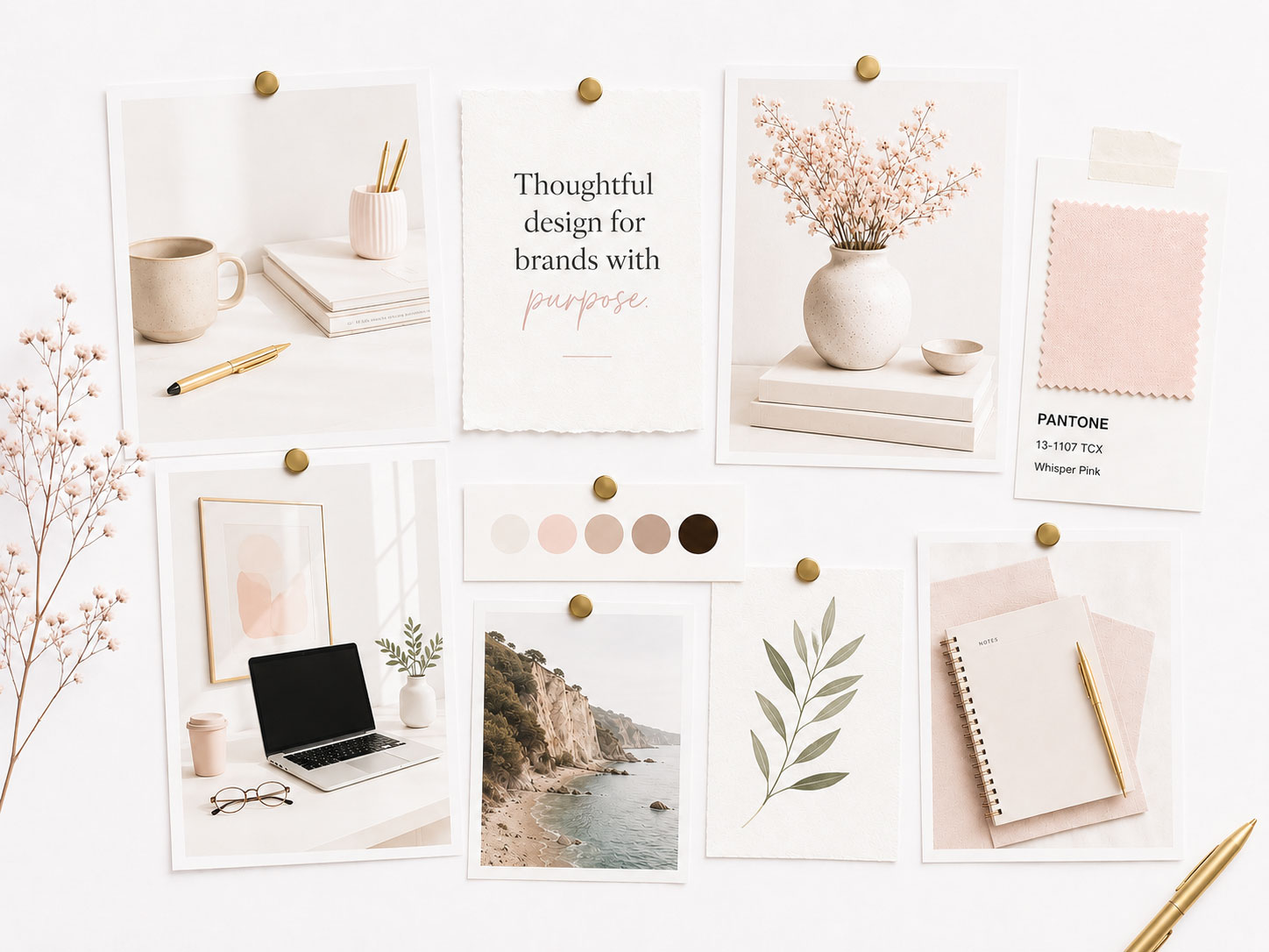
People remember the feeling your photography creates long before they remember individual photos.
Designer Tip:
If one photo feels out of place, it probably is. Even a single inconsistent image can make an otherwise polished website feel disconnected.
07. Use White Space Consistently
White space isn’t empty.
It’s breathing room.
The best websites know when to slow the reader’s eye down. Generous spacing gives your content room to breathe, improves readability, and naturally draws attention to what’s most important.
Rather than filling every available space, allow sections to feel open and intentional. A layout with consistent spacing feels calmer, easier to navigate, and more professional.
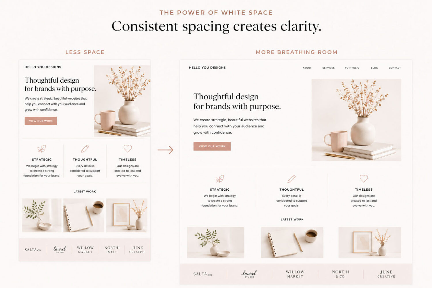
Great design isn’t about adding more—it’s about knowing what to leave out.
Designer Tip:
Don’t fill every available space. Sometimes what you leave out is just as important as what you include.
08. Create Visual Hierarchy
Great design guides the eye without visitors ever realizing it.
Every page naturally creates a reading path—from the most important message to the supporting details, and finally to the actions you want someone to take.
When visual hierarchy is done well, readers don’t have to figure out where to look—they simply follow the path you’ve designed.

Design guides attention before anyone reads a word.
09. Maintain Consistency Across Every Page
Your homepage may be where visitors first discover your brand—but it isn’t where they decide whether your website feels professional.
That decision happens as they move from page to page.
Every page should feel like it belongs to the same website—whether someone visits your:
Your typography, spacing, colors, photography, buttons, and overall layout should all feel familiar. Visitors shouldn’t have to “learn” your website over again every time they click a new page.
When every page feels connected, visitors stop thinking about individual pages and start remembering your brand.
Many consistency problems actually begin before you design a single page. Choosing a flexible foundation makes it much easier to create a cohesive experience. If you’re still selecting a theme, read How to Choose the Right WordPress Theme for Your Brand.
Designer Tip:
Design your inner pages with as much care as your homepage.
10. Let Your Brand Become Recognizable
Recognition doesn’t happen because your logo appears everywhere.
It happens because every design decision reinforces your identity.
Every time someone visits your website, they should recognize your brand before they ever notice your logo.
That’s what consistency creates.
It isn’t just your:
It’s how every one of those elements works together.
When they’re used consistently, your website stops looking like a collection of pages—and starts feeling like a recognizable brand.
Once your website feels cohesive, the next step is avoiding the design mistakes that quietly undermine trust. 7 Website Design Mistakes That Make Your Site Look Unprofessional covers the most common issues to watch for.
Your brand isn’t one design decision. It’s thousands of consistent ones.
Designer Tip:
When you’re unsure whether something belongs on your website, ask yourself: “Does this feel like the rest of my brand?” If the answer is no, trust that instinct.
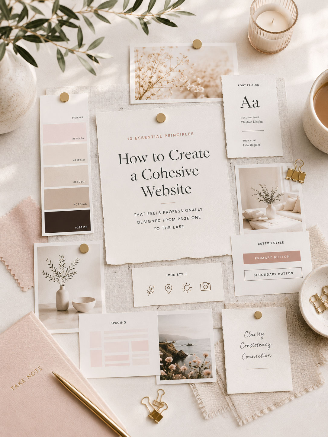
Looking for a WordPress theme built around consistency?
Every Hello You Designs theme is built using thoughtfully designed layouts, cohesive typography, flexible page templates, and reusable design systems—making it easy to create a website that feels polished from your homepage to your last blog post.