
Homepage Design: 10 Elements Every Great Website Needs
12 MIN READ
Learn how thoughtful homepage design guides visitors, builds trust, and helps your website achieve its goals.
Your homepage is often the first impression someone has of your brand.
In just a few seconds, visitors decide whether your website feels trustworthy, professional, and worth exploring further. That’s why a well-designed homepage isn’t about fitting as much information as possible onto one page—it’s about guiding visitors naturally from one section to the next.
Every section should have a purpose. Together, they create a website that feels intentional, organized, and easy to navigate.
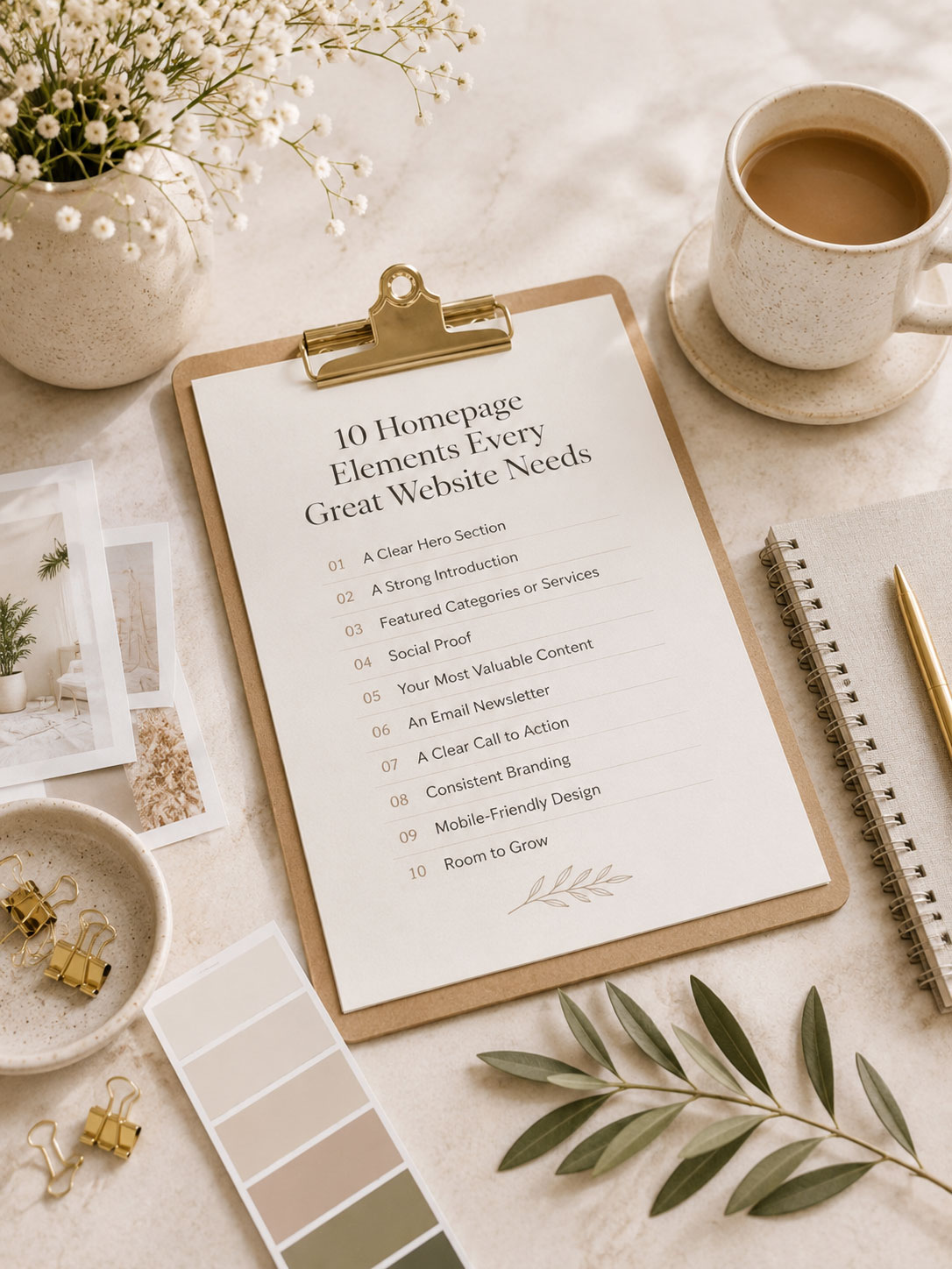
In this guide, we’ll look at ten essential homepage elements that help create a website people genuinely enjoy exploring.

In This Article
01 A Clear Hero Section
02 A Strong Introduction
03 Featured Categories or Services
04 Social Proof
05 Your Most Valuable Content
06 An Email Newsletter
07 A Clear Call to Action
08 Consistent Branding
09 Mobile-Friendly Design
10 Room To Grow
01. A Clear Hero Section
Your hero section sets the tone for your entire website.
It should immediately communicate who you are, what you do, and why visitors should continue exploring. A clear headline, supporting text, and one primary call to action often outperform a complicated slider filled with competing messages.
Visitors shouldn’t have to guess what your website is about.
01
Headline
Clearly communicate your purpose.
02
Supporting Copy
Explain what visitors can expect.
03
Call to action
Guide visitors toward the next step.
04
Photography
Use imagery that reflects your brand.
A great homepage doesn’t compete for attention—it guides it.
View → 7 Website Design Mistakes That Make Your Site Look Unprofessional
02. Look Beyond the Demo
Once visitors understand what your website is about, they’re ready to learn a little more about you.
A short introduction helps create trust without overwhelming readers. Instead of telling your entire story, simply explain who you serve, what you create, and why you’re passionate about it.
Think of it as an invitation to continue exploring.

Designer Tip:
Keep your introduction concise. Save the full story for your About page.
03. Featured Categories or Services
One of the biggest mistakes websites make is assuming visitors know where to click next.
Featured categories, popular topics, or service sections provide clear paths through your website and encourage visitors to explore the content that’s most relevant to them.
Good navigation isn’t just found in the menu—it exists throughout the homepage.
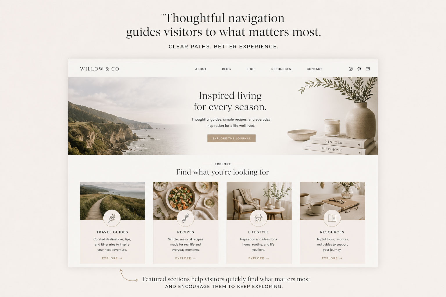
Every homepage should answer the question, “Where should I go next?”
04. Social Proof
People naturally look for reassurance before taking action.
Logos, testimonials, client features, publication mentions, reviews, or customer numbers all help build confidence that your business is established and trustworthy.
Even a few carefully selected testimonials can make a significant difference.
Instead of…
Look for…
If you’re just getting started, you don’t need dozens of testimonials on day one. Start by building trust in other ways—share your story, explain your process, showcase your work, or highlight your experience. As your business grows, testimonials, reviews, and client features will naturally become part of your website.
Designer Tip:
Don’t feel like you need to include a testimonial section until you have something meaningful to share. If you don’t have testimonials yet, replace the section with something that builds confidence, like your experience, process, or portfolio.
05. Your Most Valuable Content
Don’t make visitors search for your best work.
Highlight your most popular blog posts, favorite resources, featured products, or signature services directly on the homepage.
This creates momentum and encourages readers to continue exploring.
If everything is important, nothing stands out.
06. An Email Newsletter
Not every visitor will be ready to take action the first time they visit your website. An email newsletter gives you a way to stay connected, build trust over time, and invite readers back when you have something new to share.
Even if you don’t have a free guide or a complete email strategy yet, it’s worth giving visitors a simple way to stay connected. Many website owners wait until they realize they need an email list—only to discover they’ve missed months or even years of opportunities to build relationships.
You don’t need a complicated email funnel to get started. A simple newsletter signup with a short explanation of what subscribers can expect is enough. You can always refine your strategy as your audience grows.
Designer Tip:
Start collecting email addresses sooner than you think you need to. You can always improve your newsletter later—but you can’t recover subscribers you never collected.
07. A Clear Call to Action
Every homepage should lead somewhere.
Whether that’s exploring your blog, shopping your products, booking a service, or joining your newsletter, visitors should never wonder what to do next.
Keep your calls to action simple, visible, and consistent throughout the page.
Good design removes hesitation.
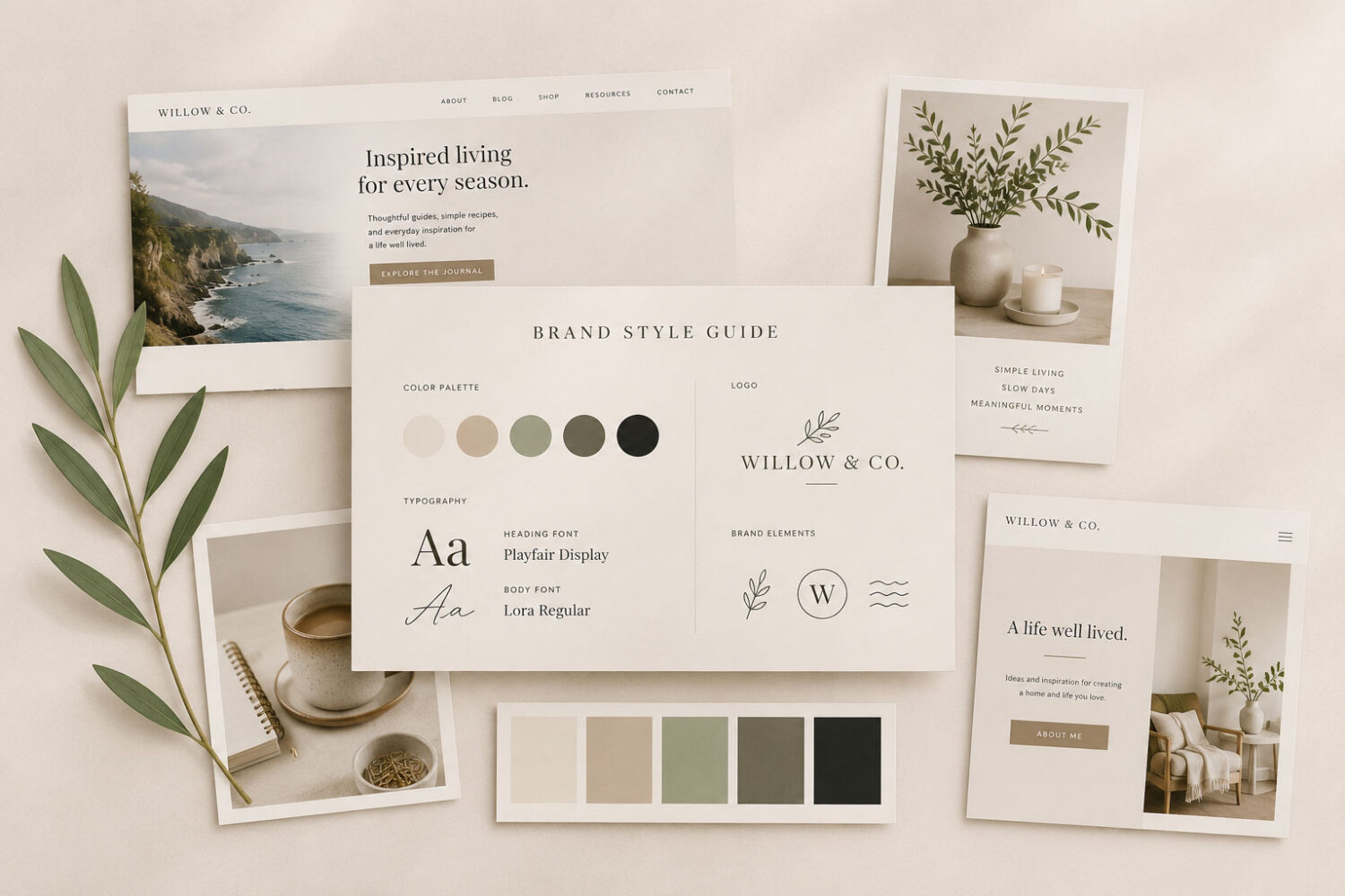
08. Consistent Branding
Typography, colors, photography, and spacing should work together to create one cohesive experience.
When every section feels connected, your website becomes memorable—not because of flashy effects, but because it feels intentional.
Consistency creates confidence.
View → Your Website Should Feel Like Your Brand, Not Just Another Template.
09. Mobile-Friendly Design
More than half of your visitors will likely view your website on a phone.
A beautiful desktop design means very little if your homepage feels confusing or difficult to navigate on smaller screens.
Prioritize readability, touch-friendly buttons, and simplified layouts.
Designer Tip:
Always review your homepage on both desktop and mobile before publishing.
10. Room to Grow
Your homepage isn’t finished the day it launches.
As your business evolves, your homepage should evolve with it.
Leave space for future products, services, blog categories, testimonials, or new content so your website can continue growing alongside your brand.
Choose a layout that’s flexible enough to adapt over time rather than one that’s locked into a single purpose.
View → How to Choose the Right WordPress Theme for Your Brand
The best homepages are designed for where your business is going—not just where it is today.
Looking for a Homepage Designed With Purpose?
Every Hello You Designs theme is thoughtfully designed with flexible homepage layouts that guide visitors naturally while giving you the freedom to customize every section to fit your brand.
Explore professionally designed WordPress themes created to help you build a homepage that’s welcoming, intentional, and designed to grow with your business.