
How to Choose the Right Fonts for Your Website
10 MIN READ
Typography is one of the first things visitors notice—even before they begin reading your content. Learn how to choose fonts that reflect your brand, improve readability, and create a polished, professional website.
Typography is one of the most powerful design tools you have. Before visitors read a single word, they’ve already formed an impression based on how your website looks—and your fonts play a huge role in that first impression.
The right typography helps your website feel polished, trustworthy, and aligned with your brand. The wrong typography can make even beautiful layouts feel unorganized or difficult to read.
The good news? You don’t need dozens of fonts to create a beautiful website. You simply need the right ones.
In this guide, you’ll learn how to choose fonts that reflect your brand, improve readability, and create a website that feels polished from the very first impression.
In This Article
01 Start With Your Brand Personality
02 Understand the job of each font
03 Prioritize Readability
04 Pair Fonts With Intention
05 Use a Simple Typography System
06 Create a Typography Hierarchy
07 Be Consistent Across Every Page
08 Don’t Be Afraid to Invest in Quality Fonts
09 Maintain Consistency Across Every Page
01. Start With Your Brand Personality
Your fonts should support your brand—not compete with it. Before browsing thousands of fonts, ask yourself how you want your website to feel.
Do you want visitors to see your brand as:
Typography communicates your brand personality long before visitors read their first word.
A travel blogger, wedding photographer, online shop, and business coach could all use beautiful typography—but each should choose fonts that reflect their own unique style.
If you haven’t defined your overall brand yet, start with Your Website Should Feel Like Your Brand, Not Just Another Template before choosing your typography.
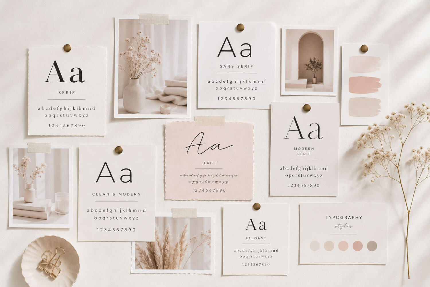
The best fonts don’t stand out—they make your brand stand out.

Designer Tip:
Choose fonts based on your brand personality—not because they’re trending.
02. Understand the Job of Each Font
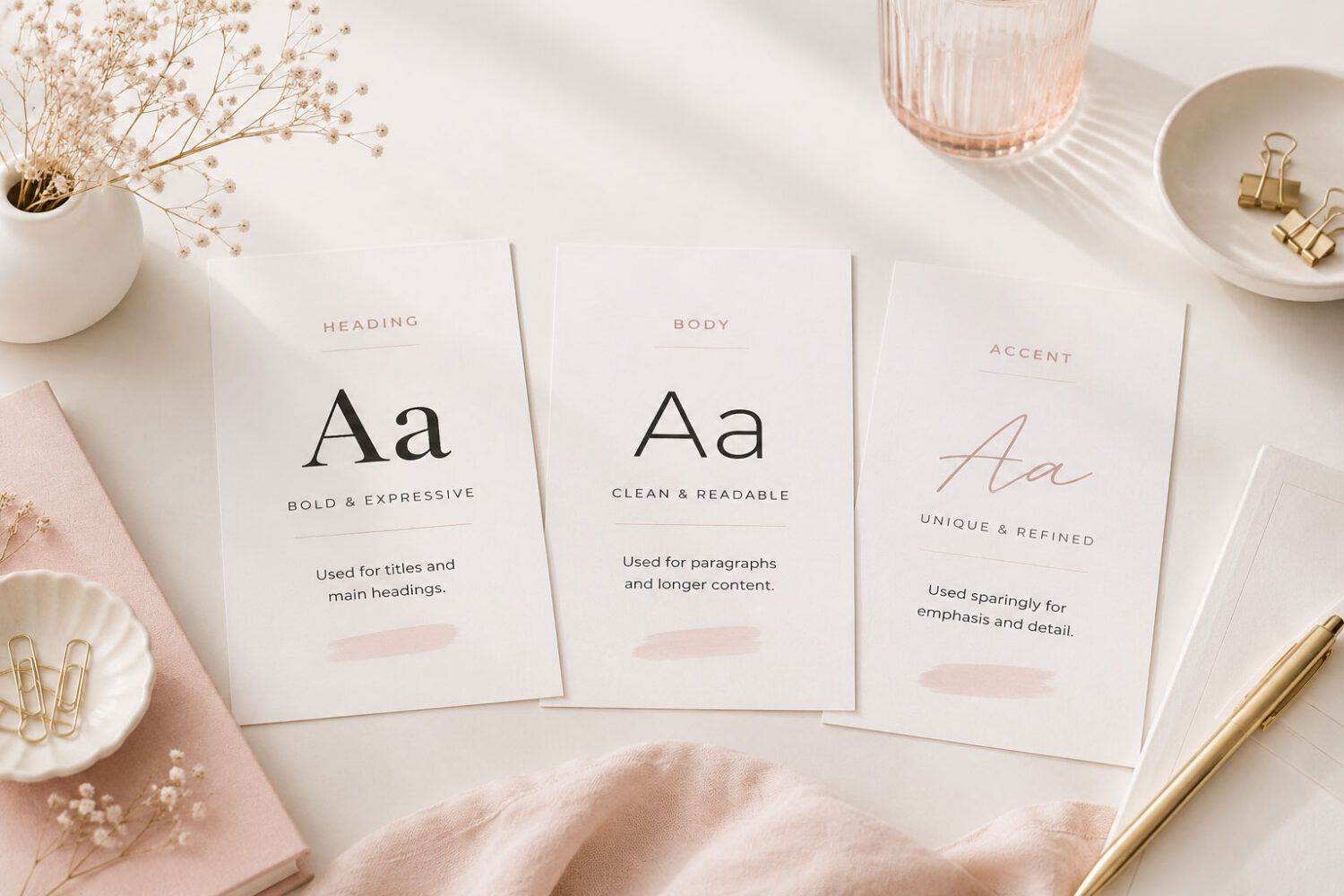
Every font has a purpose. Instead of choosing fonts randomly, assign each one a role.
Most websites use a small set of typography roles. Here is how that system looks inside the Hello Aster Theme:

Headings

Body
SUbheading
H5 · H6 · Buttons · Nav

Accent
Your heading font creates personality. Your body font keeps longer content comfortable to read. Your subheading font supports smaller headings, navigation, and buttons, while your accent font adds character without overwhelming the design.
In every Hello You Designs theme, these typography roles are already set for you. You can keep the original font pairing or change each style once, and it will update consistently throughout your website.
Think of typography as a team rather than individual pieces.
03. Prioritize Readability
Beautiful typography means very little if people struggle to read it. Highly decorative fonts may look stunning in a logo or heading, but they quickly become exhausting in long paragraphs.
When choosing a body font, look for one that’s designed for comfortable, everyday reading.
Body text should always be:
If visitors have to work to read your content, they’ll often leave before they ever discover how valuable it is.
Beautiful typography invites people to read. Readable typography keeps them reading.
Designer Tip:
Preview your typography on both desktop and mobile. If it feels difficult to read on either one, choose a simpler font or increase its size.
04. Pair Fonts With Intention
Good font pairings create contrast. They don’t compete.
Successful font pairings create contrast while still feeling like they belong together. The goal isn’t to choose dramatically different fonts—it’s to create balance.
One of the simplest combinations is:
A Classic Combination
Heading
Market Serif

Sans Body
Poppins
This pairing is popular because it creates clear contrast while remaining timeless, making it an excellent choice for almost any type of website.
Other Pairings That Work Well
Serif Heading
Serif Body
A refined combination that works well when the fonts have different weights or personalities.
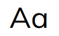
Sans Heading
Sans Body
A clean, modern pairing that relies on size and weight to create hierarchy.
Serif
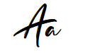
Script
Adds elegance and personality when the script font is used sparingly.
Every Hello You Designs theme begins with thoughtfully selected font pairings that are designed to work beautifully together. You can keep the original pairing or swap fonts while maintaining the same typography structure throughout your website.
As your brand evolves, you can update your heading, body, accent, or supporting fonts once, and those changes automatically carry throughout your entire website.
No matter which fonts you choose, each one should have a clear role. When fonts become too similar, the pairing often feels accidental instead of intentional.
05. Use a Simple Typography System
One of the most common website design mistakes is adding too many fonts.
More fonts don’t create personality. They create inconsistency.
Instead of choosing a new font for every section, build a simple typography system where each font has a clear purpose.
For most websites, that means defining:
These roles don’t always require four different fonts. In many cases, your subheadings and body text can share the same typeface, while different sizes and weights create the visual hierarchy.
A simple typography system creates consistency across every page and makes your website feel intentional rather than pieced together.
If you’re working toward a more polished website overall, you’ll also enjoy How to Create a Cohesive Website That Feels Professionally Designed, where consistency becomes one of the biggest design principles.
A consistent typography system always feels more professional than a collection of beautiful fonts.
06. Create a Typography Hierarchy
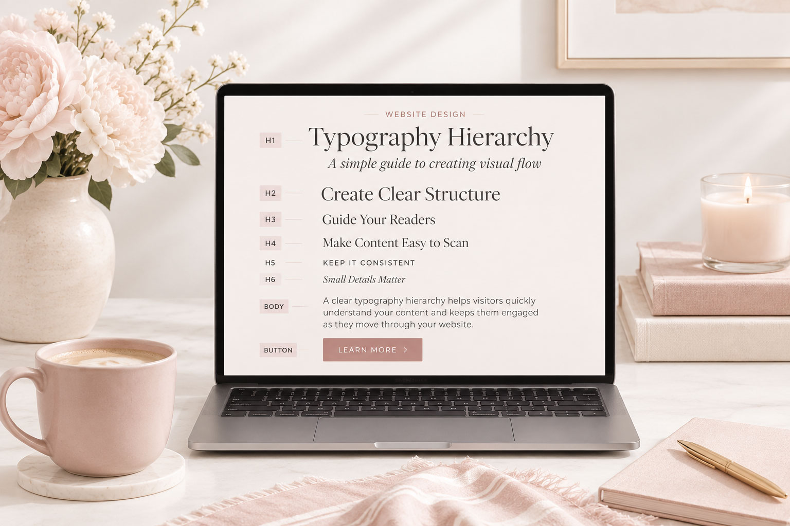
Visitors shouldn’t have to guess what to read first. A clear typography hierarchy naturally guides their eyes through the page.
A simple hierarchy might look like:
H1
↓
H2
↓
H3
↓
H4
↓
H5 & H6
(Subheading Font)
↓
Body Text
↓
Each level should feel related while remaining clearly distinct. Every heading level should become slightly less prominent, creating a natural path from your main message to the smallest supporting details.
A strong hierarchy makes long pages easier to scan and keeps readers moving naturally through your content.
Want to see how typography works alongside spacing, imagery, and layout? Read Homepage Design: 10 Elements Every Great Website Needs. to learn how visual hierarchy guides visitors through every page.
07. Be Consistent Across Every Page
Once you’ve chosen your typography, let it become part of your brand identity.
Whether visitors are reading your blog, browsing your shop, learning about your services, or contacting you, every page should feel connected by the same typography system.
Typography consistency is one of the fastest ways to build trust because visitors immediately recognize they’re experiencing the same brand.
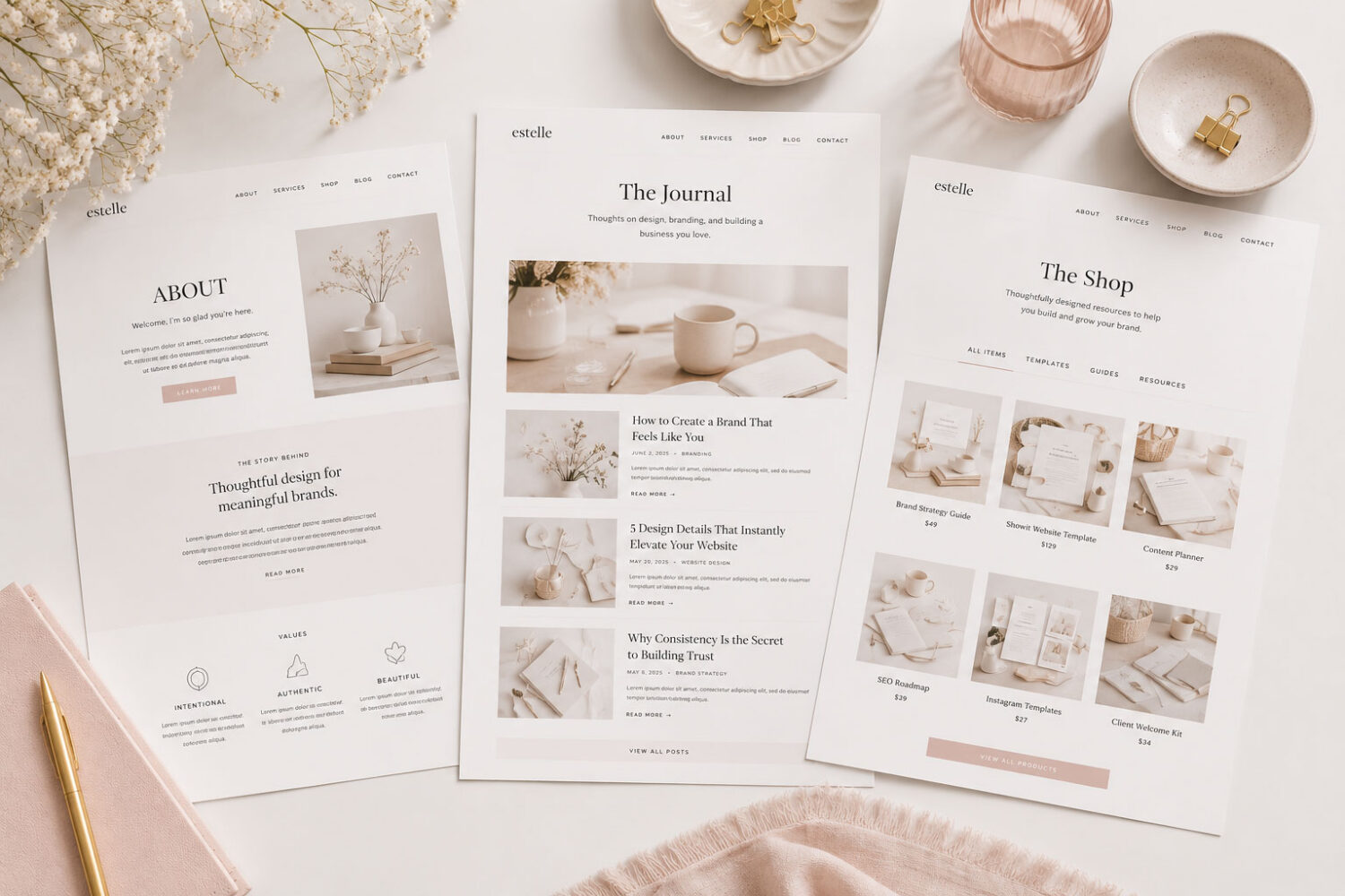
Consistency creates recognition. Recognition builds trust.
Designer Tip:
Once you’ve established your typography system, resist the urge to redesign it for every new page.
08. Don’t Be Afraid to Invest in Quality Fonts
Great typography works harder than almost any other design element on your website.
It appears on every page, every heading, every blog post, and every call to action—making it one of the few design decisions visitors see over and over again. While free fonts can certainly work well, premium fonts often provide more thoughtful spacing, additional weights, stylistic alternates, multilingual support, and refined details that help a website feel more polished and professional.
The goal isn’t to collect more fonts—it’s to choose fonts you’ll enjoy using for years.
If you’re looking for editorial-inspired fonts, the Hello You Designs Font Collection was created specifically for branding and websites, with thoughtfully crafted typefaces that pair beautifully together.
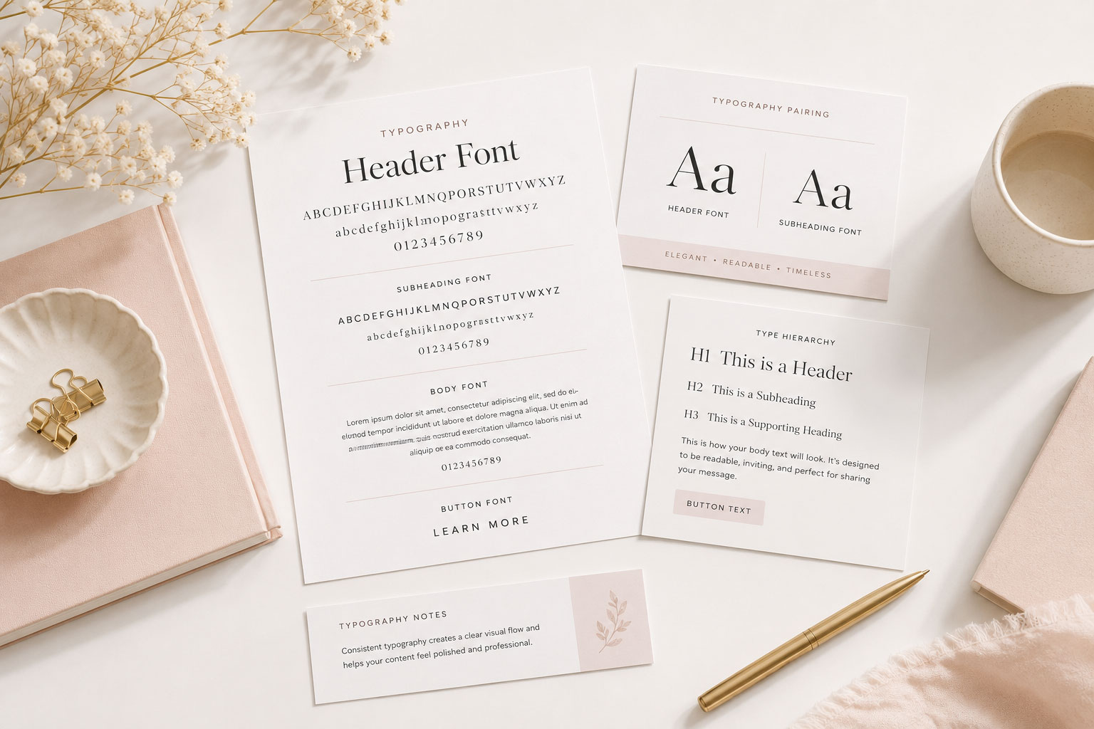
Choose fonts you’ll still love a year from now—not just the ones that are popular today.
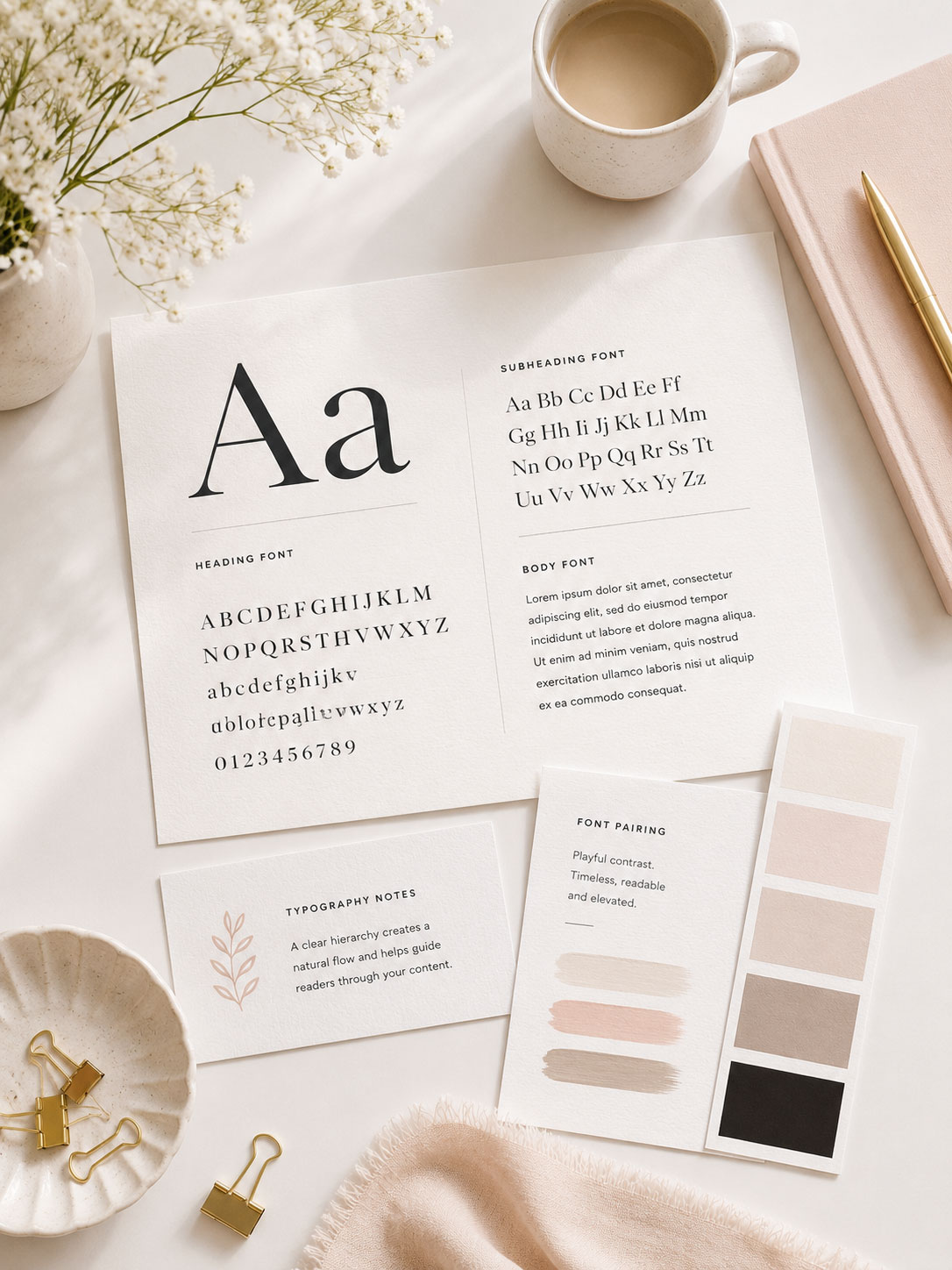
Typography isn’t decoration. It’s communication.
Every heading, paragraph, button, and caption shapes how visitors experience your brand.
When your typography is intentional, readable, and consistent, your website feels more polished before visitors even read their first sentence.
Your fonts don’t just tell people what to read.
They tell people how your brand feels.
Looking for a complete website? Browse our WordPress themes.