
Website Navigation Best Practices: Help Visitors Find What They’re Looking For
10 MIN READ
Good navigation shouldn’t make visitors think—it should quietly guide them from one page to the next. Learn how to create clear, intuitive website navigation that helps people find exactly what they’re looking for.
You’ve carefully chosen your fonts, refined your color palette, and created beautiful page layouts. But even the best-designed website can become frustrating if visitors don’t know where to click next.
Website navigation is more than just the menu at the top of your website. It’s the system that helps visitors understand where they are, what your website offers, and where to go next. When navigation is done well, visitors rarely notice it—they simply move through your website naturally.
Whether you’re building a blog, an online shop, or a business website, thoughtful navigation creates a smoother experience that encourages visitors to stay longer, explore more pages, and feel confident interacting with your brand.
In this article, you’ll learn how to create website navigation that’s simple, intuitive, and designed with your visitors in mind.
In This Article
01 Why Navigation Is One of the Most Important Parts of Your Website
02 Start With Your Visitors, Not Your Sitemap
03 Choose Navigation Labels That Are Clear and Familiar
04 Create a Visual Hierarchy Within Your Navigation
05 Help Visitors Keep Moving Through Your Website
06 Design Navigation That Works on Every Device
07 Small Details That Make Navigation Feel Effortless
08 Bringing Everything Together
01. Why Navigation Is One of the Most Important Parts of Your Website
Navigation is often treated as something you think about after designing the rest of your website. In reality, it’s one of the first things visitors use to understand your content.
Imagine walking into a bookstore. If every section were unlabeled and books were placed randomly on shelves, finding what you wanted would quickly become frustrating. Your website works the same way. Visitors rely on your navigation to understand how your website is organized before they ever begin reading.
Clear navigation builds confidence. Visitors know where to click, what to expect, and how to continue exploring without feeling lost.
The best navigation rarely calls attention to itself—it simply makes every part of your website feel easier to use.
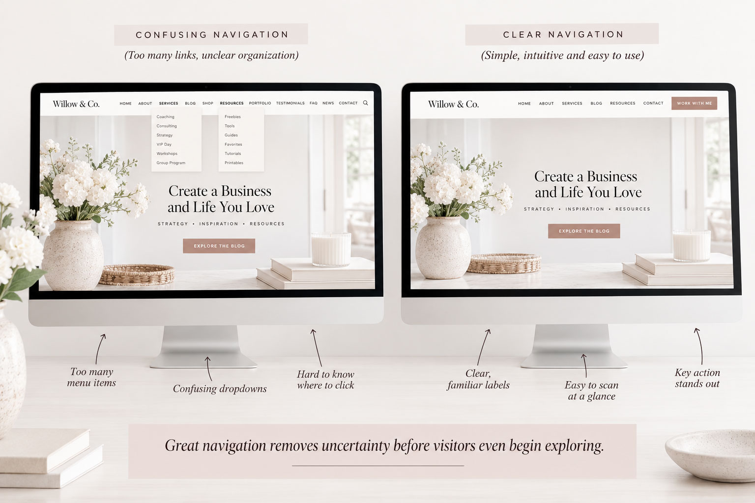
Great navigation isn’t about giving visitors more choices. It’s about helping them make the right one.
02. Start With Your Visitors, Not Your Sitemap
One of the most common website navigation mistakes is organizing your website around how it’s built instead of how visitors actually use it.
As the website owner, you know exactly where everything lives. Your visitors don’t.
Instead of asking, “Where should I put this page?,” ask yourself, “If I were visiting this website for the first time, where would I expect to find this information?”
That simple shift in perspective changes everything.
Visitors naturally group information into broad categories. Services belong together. Resources belong together. Products belong together. When your navigation follows those expectations, visitors spend less time searching and more time engaging with your content.
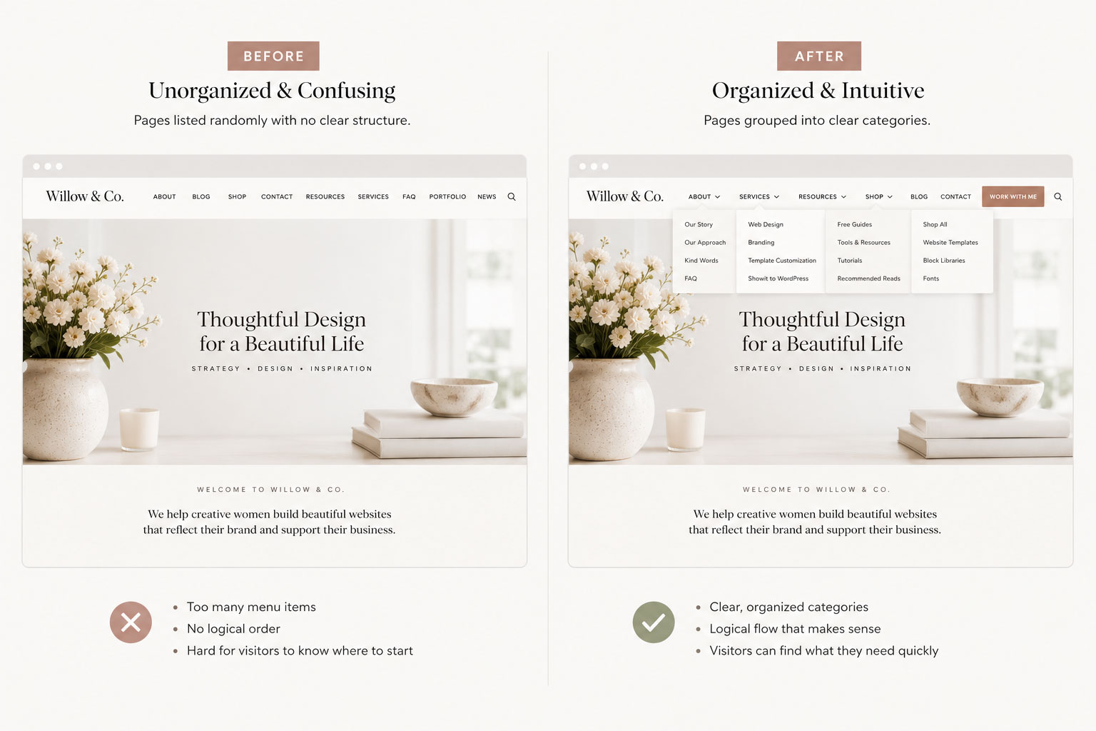

Designer Tip:
Organize your navigation around how visitors think, not how your files are organized behind the scenes.
03. Choose Navigation Labels That Are Clear and Familiar
Your menu labels should tell visitors exactly what they’ll find before they click.
Creative page names can feel unique, but they often create hesitation. If someone has to stop and interpret a menu item, you’ve introduced unnecessary friction.
Simple labels like About, Services, Blog, Shop, and Resources immediately communicate what visitors can expect.
Clarity almost always beats cleverness.
Your branding and design are what give your website personality. Your navigation should make visitors feel confident using it.
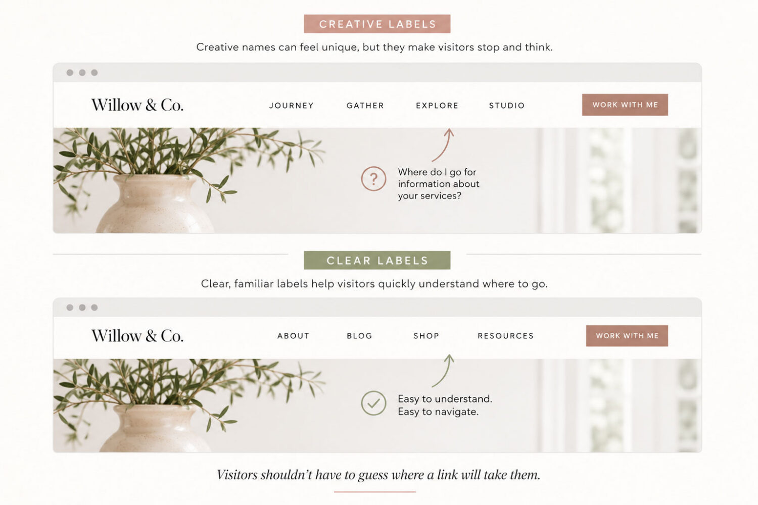
Visitors shouldn’t have to guess where a link will take them.
04. Create a Visual Hierarchy Within Your Navigation
Not every page deserves equal attention.
Most websites have one or two actions they want visitors to take—book a service, browse the shop, join a newsletter, or contact the business.
Your navigation should quietly reinforce those priorities.
A well-designed call-to-action button, thoughtful spacing, or subtle emphasis can naturally guide attention without overwhelming the rest of the menu.
The goal isn’t to make everything stand out.
It’s to help the most important action stand out.
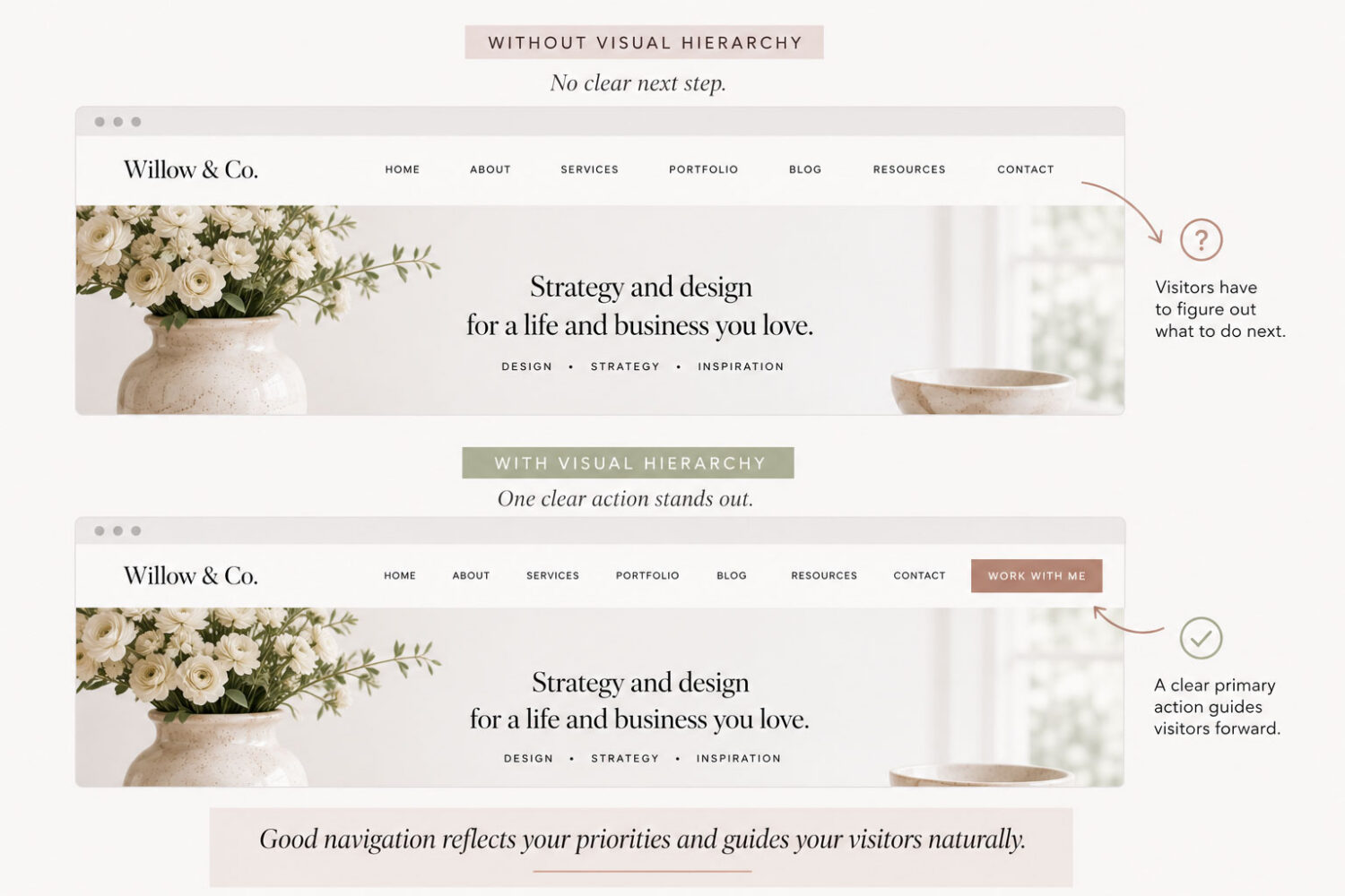

Design Insight:
Navigation should reflect your website’s goals—not simply list every page you have.
05. Help Visitors Keep Moving Through Your Website
Navigation doesn’t stop after someone clicks your menu.
Think about what happens next.
Every page should encourage visitors to continue exploring your website. Whether that’s through related articles, previous and next links, featured resources, category pages, or helpful footer links, each page should offer a clear path forward.
Instead of asking visitors to return to your homepage each time, create natural pathways that encourage exploration.
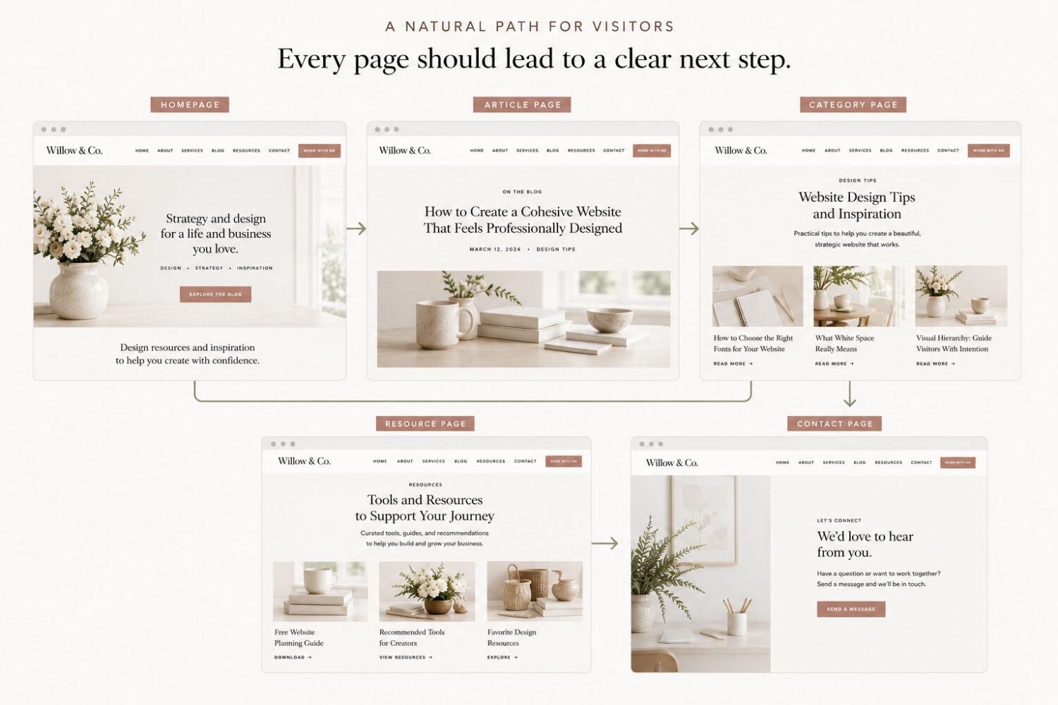
Designer Tip:
Every page should answer one simple question: “Where should visitors go next?”
06. Design Navigation That Works on Every Device
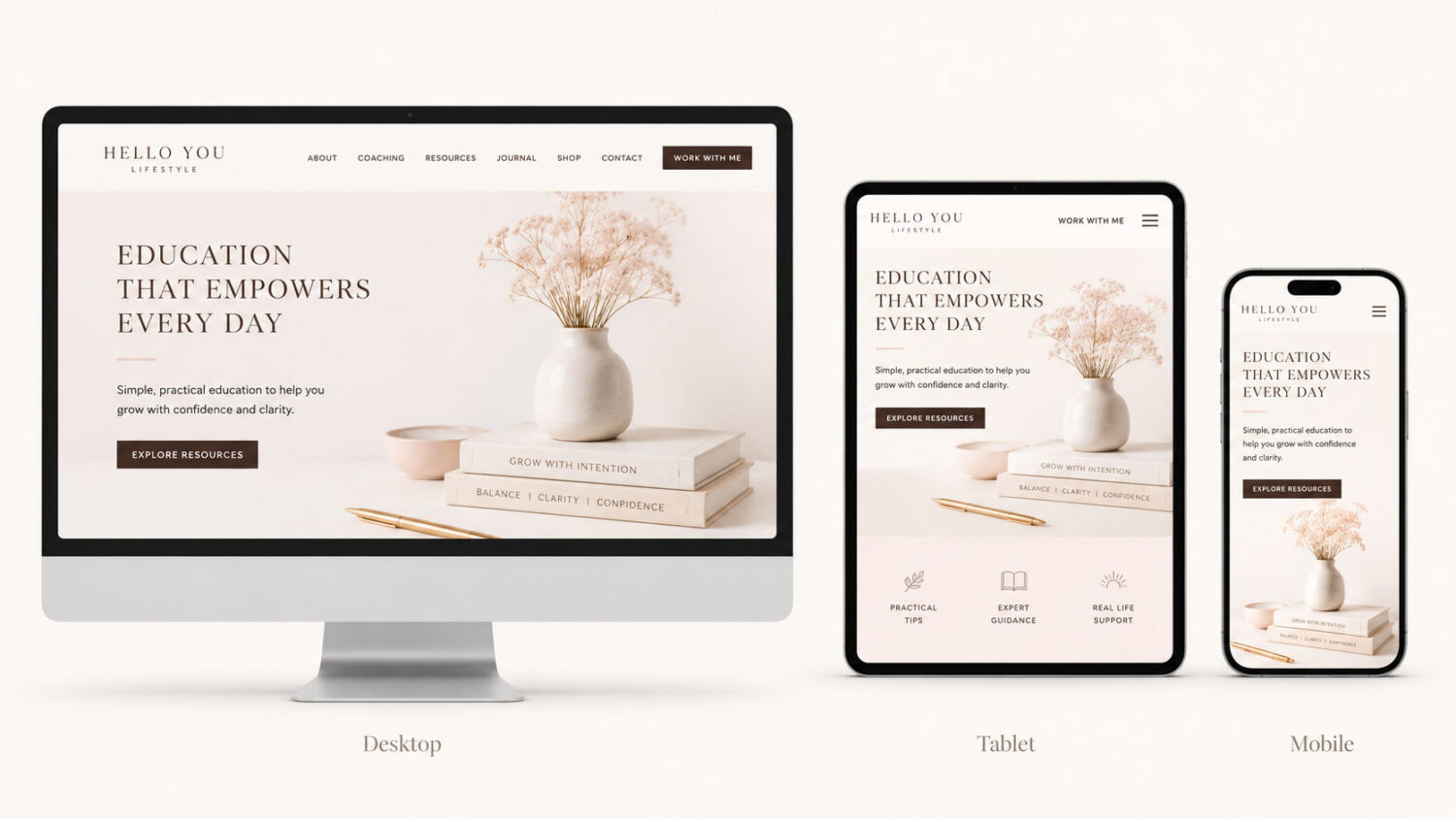
Today’s visitors move between desktops, tablets, and phones without thinking about it. Your website navigation should do the same.
A menu that’s easy to scan on a large monitor may become overwhelming on a smaller screen. Keep your mobile navigation organized, prioritize your most important links, and make tap targets comfortable to use.
Don’t think of mobile as a simplified version of your desktop website. Instead, think of it as another opportunity to create a great experience.
07. Small Details That Make Navigation Feel Effortless
The best navigation often succeeds because of the smallest details.
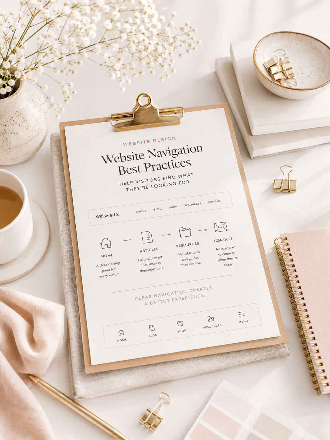
Consistent menu placement, clear hover states, a visible active page, thoughtful footer navigation, search functionality when appropriate, and breadcrumbs for larger websites all contribute to a smoother browsing experience.
None of these features are dramatic on their own, but together they create a website that feels polished, intuitive, and easy to navigate.
Visitors may never notice each of these details individually. They’ll simply notice that your website feels effortless to use.

Quick Check:
Before publishing your website, ask yourself:
08. Bringing Everything Together
Beautiful websites don’t just look good—they make visitors feel confident.
Thoughtful navigation removes uncertainty, reduces frustration, and quietly guides visitors toward the information they’re looking for.
When your navigation feels intuitive, your content becomes easier to discover, your pages become more engaging, and visitors are more likely to keep exploring.
Like good typography, thoughtful color, and generous white space, great navigation is something people often don’t notice until it’s missing.
The best navigation isn’t something visitors notice—it’s something they never have to think about.
Beautiful navigation starts with thoughtful design.
Every Hello You Designs theme is built with clear, intuitive navigation that helps visitors explore your website naturally—whether you’re creating a blog, business website, online shop, or portfolio. With professionally designed layouts and easy customization, you can focus on your content while giving visitors an experience that feels polished from the very first click.
Some Common Design Questions
Still have questions? Here are a few quick answers to some of the most common questions about this topic.