
How to Use Color to Create a Beautiful, Cohesive Website
10 MIN READ
Learn how to choose and use color intentionally to create a website that feels polished, professional, and unmistakably your brand.
Color is often one of the first things people notice about a website.
It sets the mood, reinforces your brand, and helps visitors understand where to focus their attention. Using color effectively isn’t about adding more of it. In fact, many of the most beautiful websites use surprisingly little color at all.
Thoughtful color choices create consistency, improve readability, and make important elements stand out without overwhelming the page. When every color has a purpose, your website feels more refined and easier to navigate.
In this article, you’ll learn how to create a cohesive color palette, use color to guide visitors naturally through your content, and avoid the common mistakes that make websites feel cluttered or inconsistent.
In This Article
01 Why Color Matters More Than You Think
02 Start With a Small Color Palette
03 Using Color to Guide Attention
04 Creating Contrast Without Creating Chaos
05 Keeping Your Colors Consistent Across Every Page
06 Common Color Mistakes to Avoid
07 Testing Your Website’s Color Palette
08 Bringing Everything Together
01. Why Color Matters More Than You Think
Color does far more than make a website look beautiful. It influences how visitors perceive your brand, where their eyes naturally focus, and how easily they move through your content.
A soft, neutral palette can feel calm and welcoming. Bold accent colors can create energy and excitement. Even subtle differences in color can change the personality of an entire website.
The goal isn’t to use as many colors as possible. It’s to create a visual language that feels consistent from page to page.
When your colors work together, visitors spend less time trying to understand the layout and more time engaging with your content.
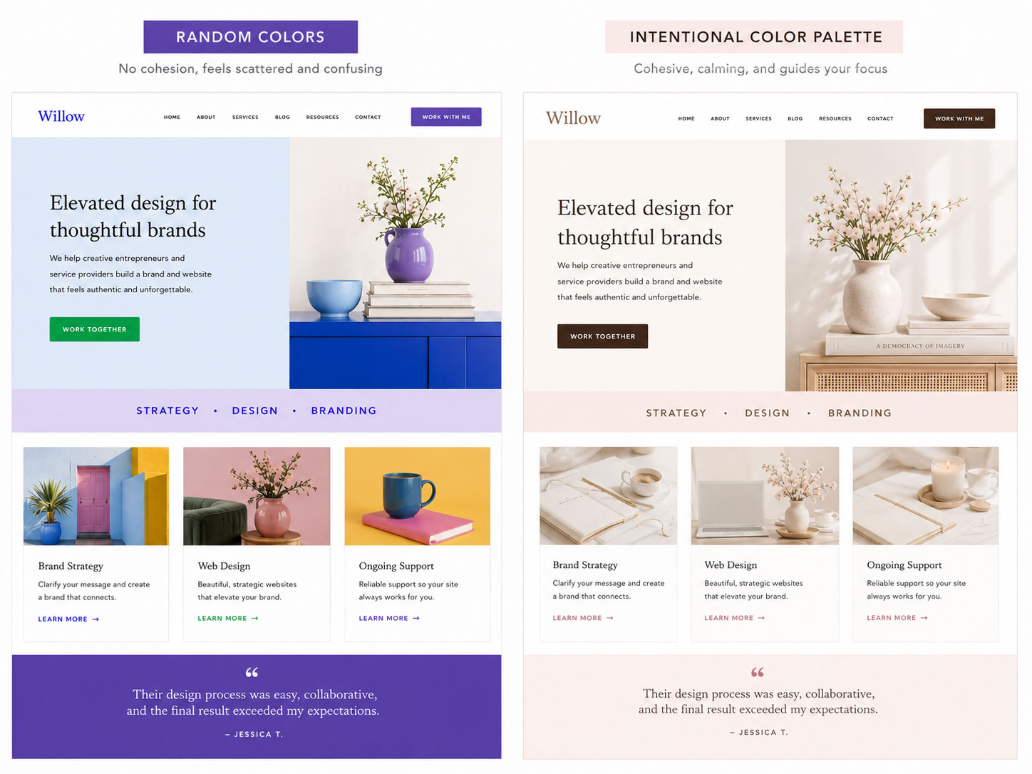
Great color choices don’t compete for attention—they quietly guide it.

Designer Tip:
Choose colors that support your content rather than overpower it. Your website should always make reading and navigation easier, not more distracting.
02. Start With a Small Color Palette
One of the biggest mistakes beginners make is using too many colors.
Every new color creates another visual decision for your visitors. Too many competing colors can make even well-designed layouts feel busy.
Instead, begin with a simple palette.
A good starting point includes:
A small palette gives your website plenty of variety while maintaining a polished, cohesive appearance.
You’ll notice that many premium websites rely heavily on white, ivory, gray, or soft neutral backgrounds, using color only where it adds meaning.


Design Insight:
Consistency is often more important than creativity. A limited palette used thoughtfully almost always looks more professional than a large palette used inconsistently.
03. Using Color to Guide Attention
Color helps visitors understand what’s most important. Think of your accent color like a spotlight. If everything is highlighted, nothing stands out.
Use your strongest color intentionally for elements such as:
Supporting content should remain more visually subtle so your primary actions naturally attract attention.
When visitors always know where to click next, your website feels easier to use.
Color works best when it creates clarity, not competition.
04. Creating Contrast Without Creating Chaos
Contrast isn’t only about black and white.
It’s about creating enough difference between elements that visitors instantly know what they’re looking at.
Good contrast helps visitors quickly distinguish:
Too little contrast makes content harder to read. Too much contrast makes everything compete for attention.
Aim for balance.
Every page should have moments of emphasis without feeling loud.
Designer Tip:
If every button, heading, icon, and background uses a different color, visitors won’t know what deserves their attention first.
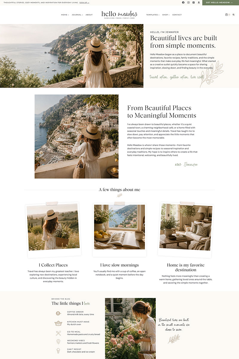
05. Keeping Your Colors Consistent Across Every Page
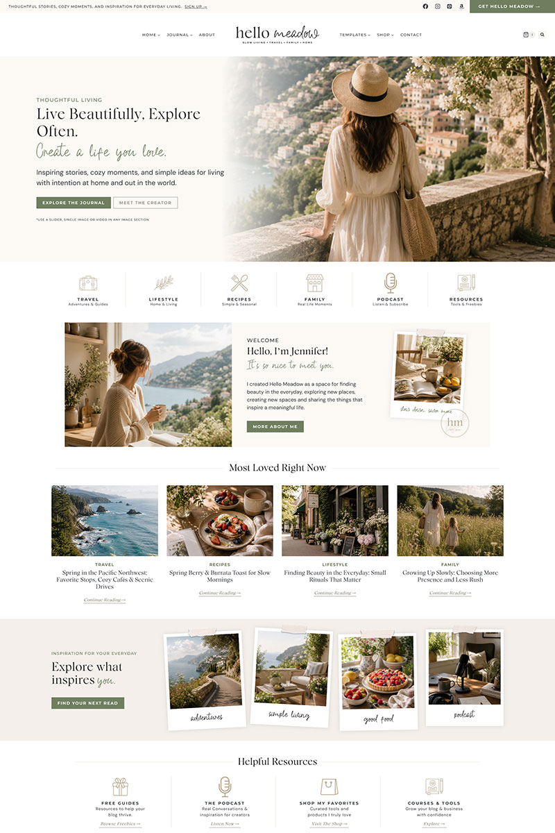
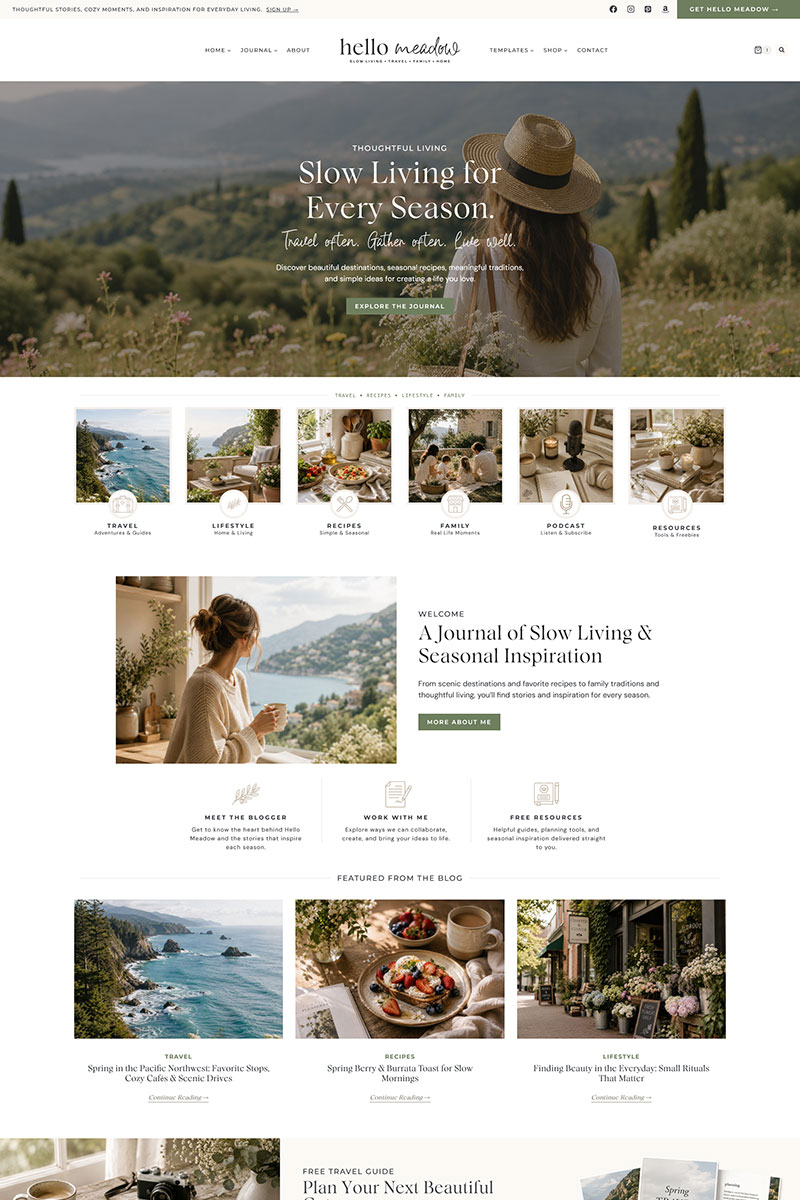
One beautiful homepage isn’t enough. Your About page, blog, services, and contact page should all feel like they belong to the same brand. Consistency creates familiarity. Visitors should begin recognizing your website long before they notice your logo.
Maintain consistency by using:
Small details repeated consistently make an entire website feel professionally designed.
Consistent Color Across Every Page
Design Insight:
Think of your color palette as part of your brand identity. Every page should reinforce that identity rather than introduce something new.
06. Common Color Mistakes to Avoid
Even a beautiful color palette can become overwhelming if it’s used without intention.
Some of the most common mistakes include:
When you’re unsure, simplify.
Removing unnecessary colors often improves a design more than adding new ones.
07. Testing Your Website’s Color Palette
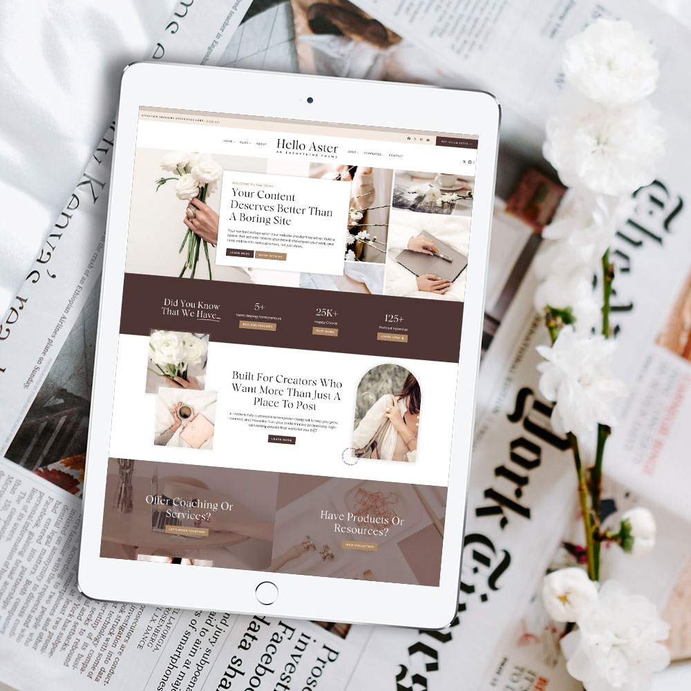
One of the easiest ways to evaluate your color palette is to zoom out and look at the page as a whole.
Ask yourself:
If one section immediately feels out of place, it’s often because a color is being used inconsistently.
Small adjustments usually create the biggest improvements.

Quick Check:
Before publishing your website, make sure:
08. Bringing Everything Together
Color is one of the simplest ways to make a website feel intentional.
You don’t need dozens of shades or bold combinations to create something memorable. More often than not, the most beautiful websites rely on restraint.
A thoughtful color palette supports your content, strengthens your brand, and naturally guides visitors through every page.
When every color has a purpose, your website becomes easier to navigate, more enjoyable to explore, and more cohesive from page to page.
Ready to Build a Website That Feels Beautiful From the Start?
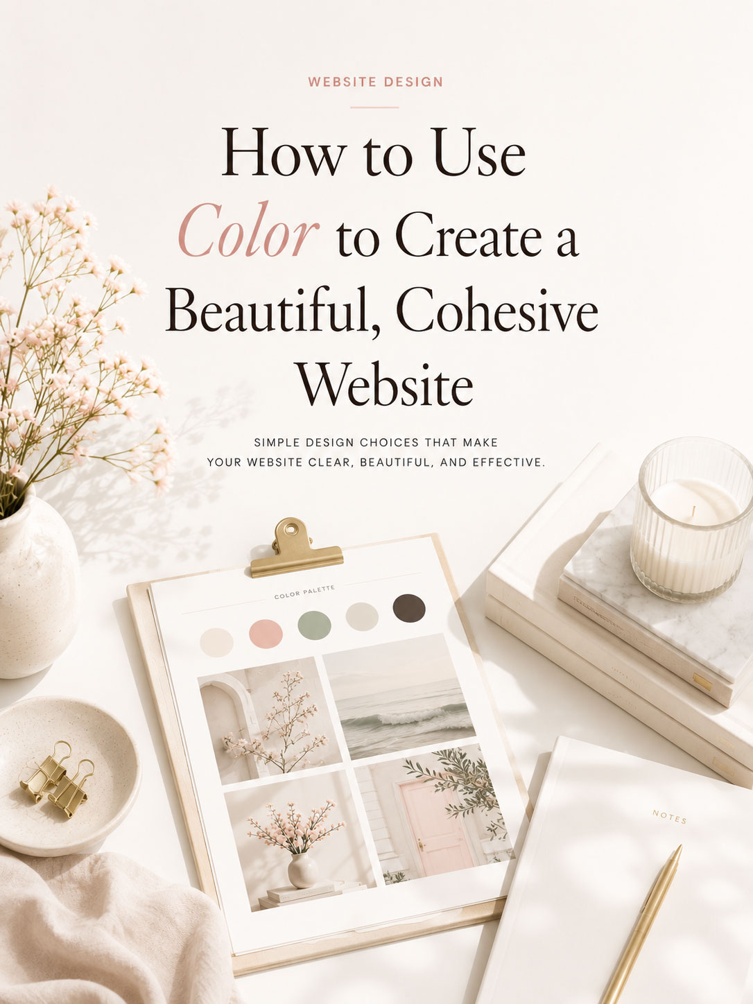
Every Hello You Designs theme includes a professionally designed color system, making it easy to create a cohesive, polished website without starting from scratch. Customize the colors to match your brand and build a site that feels uniquely yours.
Some Common Design Questions
Still have questions? Here are a few quick answers to some of the most common questions about this topic.