
How to Use White Space to Create a More Beautiful Website
15 MIN READ
Discover why the most polished websites aren’t defined by more content, but by thoughtful spacing, balance, and the confidence to let every element breathe.
When people think about beautiful website design, they often focus on colors, typography, photography, or layouts. While those elements certainly matter, one of the most powerful design tools is something you can’t actually see.
White space—sometimes called negative space—is the empty area between sections, images, headlines, buttons, and paragraphs. Although it may seem like “unused” space, it’s actually doing some of the hardest work on your website. It guides visitors through the page, makes content easier to read, helps important elements stand out, and creates the calm, polished feeling we naturally associate with professionally designed websites.
Beautiful websites aren’t successful because they contain more. They’re successful because every element has room to breathe.
Whether you’re designing your first website or refining an existing one, learning to use white space intentionally can completely transform the way your website looks and feels.
In This Article
01 What White Space Really Means
02 Why White Space Makes Websites Feel More Professional
03 Giving Every Section Room to Breathe
04 Improving Readability with Better Spacing
05 Creating Balance Between Images and Text
06 Common White Space Mistakes to Avoid
07 Designing for Mobile Without Feeling Crowded
08 Bringing Everything Together
01. What White Space Really Means
Despite its name, white space doesn’t actually have to be white. It simply refers to the intentional empty space surrounding the content on your page. That space might be ivory, blush, or even a full-width photograph. What matters is that it isn’t competing for attention—instead, it’s giving every element room to breathe.
Imagine walking into two different rooms. One is filled with furniture, decorations, and artwork on every wall, while the other contains carefully chosen pieces with space to appreciate each one. Neither room has less value, but one immediately feels calmer, more inviting, and more thoughtfully designed.
Your website works the same way. Headlines, images, buttons, and paragraphs all need space around them to feel intentional. White space isn’t about making a page look empty—it’s about making your content easier to understand.
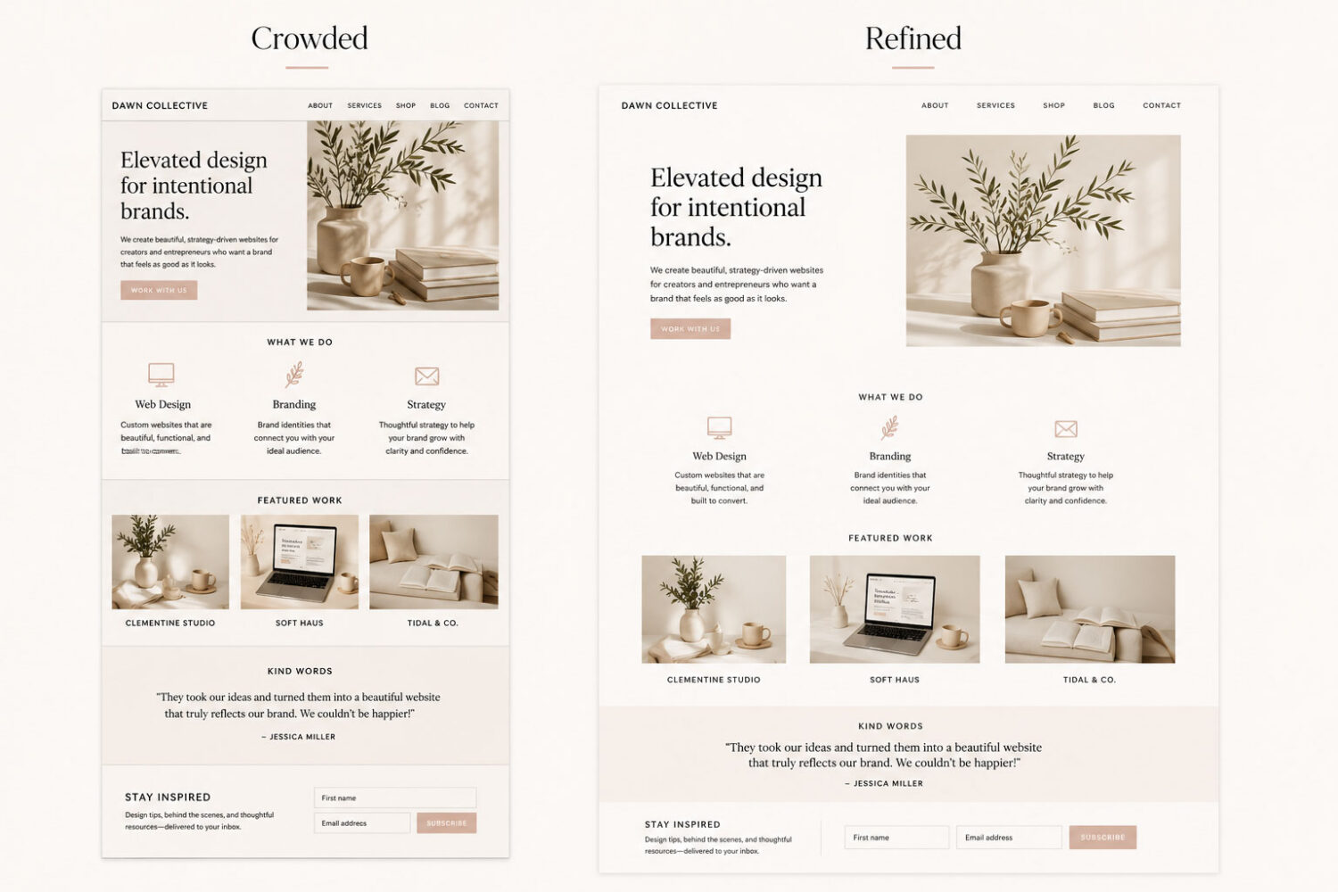
The only difference between these two layouts is spacing. The refined version feels calmer, more readable, and easier to navigate—even though the content is exactly the same.
White space isn’t empty space—it’s what gives every design element room to succeed.
02. Why White Space Makes Websites Feel More Professional
One of the easiest ways to recognize a professionally designed website is how calm it feels. Nothing appears crowded, sections transition naturally, and important elements have room to stand out instead of competing for attention.
Professional designers understand that people don’t read websites the way they read books. Visitors scan headings, pause on images, and move between sections looking for the information that matters most. White space supports this natural behavior by separating ideas into manageable pieces, making every page feel easier to navigate.
When a website feels organized, visitors instinctively trust it more. That’s because thoughtful spacing doesn’t just improve aesthetics—it communicates professionalism, confidence, and attention to detail.

Designer Tip:
Instead of asking, “What else can I add?” ask yourself, “What could I remove or give more space?” The simplest layouts are often the ones that feel the most polished.
03. Giving Every Section Room to Breathe
Every section of your website represents a new idea. You might introduce yourself, explain your services, share testimonials, or invite someone to contact you. When those sections are placed too close together, they begin to blend into one another, making the page feel busy and difficult to follow.
Generous spacing acts like punctuation for your design. It gives visitors a natural pause between ideas, helping them absorb what they’ve just read before moving on. The result is a website that feels calmer, more organized, and surprisingly easier to scroll—even when it contains the same amount of content.
Rather than trying to fit everything above the fold, allow each section to breathe. The extra space creates rhythm throughout the page and makes every headline, image, and call-to-action feel more intentional.
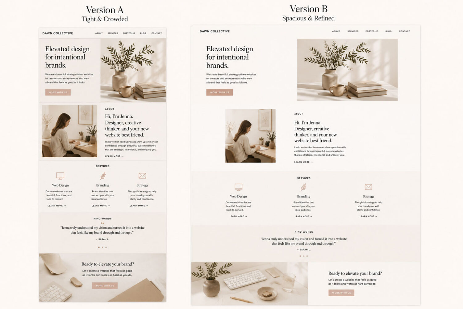
Both layouts contain the same content, colors, and typography. The only difference is the amount of space between sections—and that one change completely transforms how the page feels.

DESIGN INSIGHT:
One of the defining characteristics of Hello You Designs themes is generous, consistent spacing. Carefully balanced padding and margins create a comfortable reading experience, allowing your content—not decorative elements—to become the focal point of every page.
04. Improving Readability with Better Spacing
When most people think about readability, they immediately think about choosing the right font. While typography certainly plays an important role, even the most beautiful typeface becomes difficult to read when it’s surrounded by poor spacing.
Small adjustments to line spacing, paragraph spacing, and content width can dramatically improve how comfortable your website feels. Instead of asking visitors to work through dense blocks of text, thoughtful spacing allows their eyes to move naturally from one sentence to the next.
Imagine reading a novel where every paragraph runs together without breaks. The words themselves haven’t changed, but the experience quickly becomes overwhelming. Your website works the same way. Breaking content into shorter paragraphs and giving each one room to breathe makes even longer articles feel approachable.
White space isn’t just around your content—it’s within it. Every line, heading, list, and paragraph contributes to the overall reading experience. When those elements are given enough space, visitors stay engaged longer because reading feels effortless rather than exhausting.
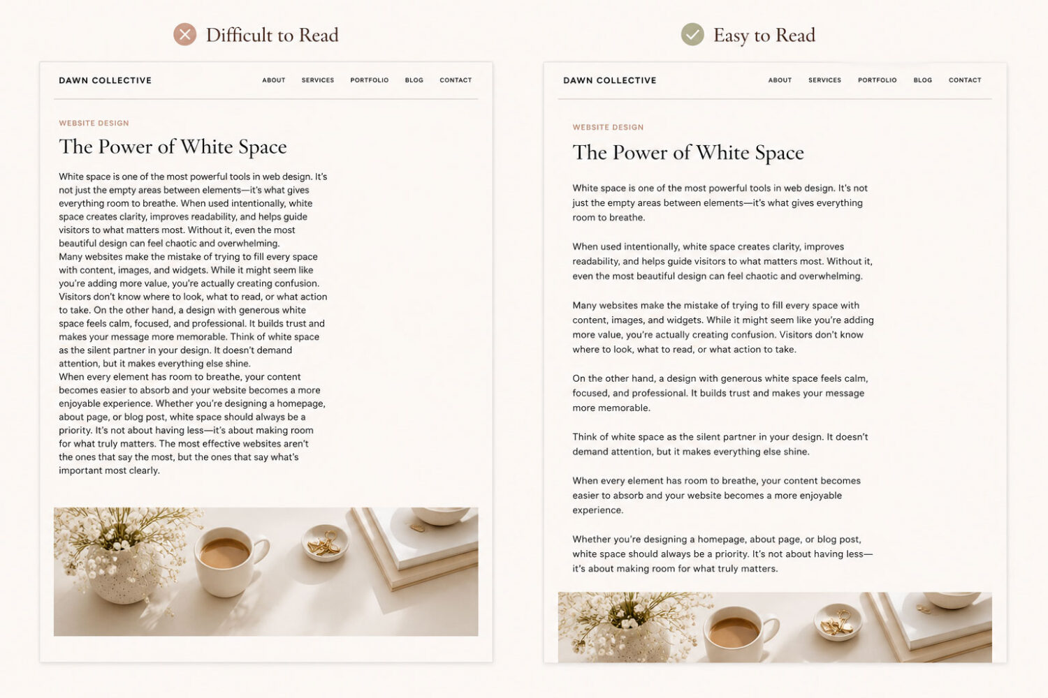
When reading feels effortless, visitors stay longer, engage more, and enjoy the experience.
05. Creating Balance Between Images and Text
Beautiful websites aren’t built with great photography alone, and they aren’t built with perfectly written copy either. The most successful designs create balance between the two, allowing images and text to support one another instead of competing for attention.
One of the most common mistakes on modern websites is treating every image like it needs to be the focal point. While large photography can create impact, using oversized images throughout an entire page often overwhelms the content. Visitors begin focusing on the visuals instead of the message, making it more difficult to understand what the page is trying to communicate.
Instead, think of photography as a way to guide your visitors through the page. Mix larger feature images with smaller supporting images, alternate text-heavy sections with visual moments, and leave enough white space around both. This creates a natural rhythm that keeps the page feeling interesting without becoming overwhelming.
Every element on your page should have a purpose. When images and content work together, visitors don’t notice the design—they simply enjoy the experience.
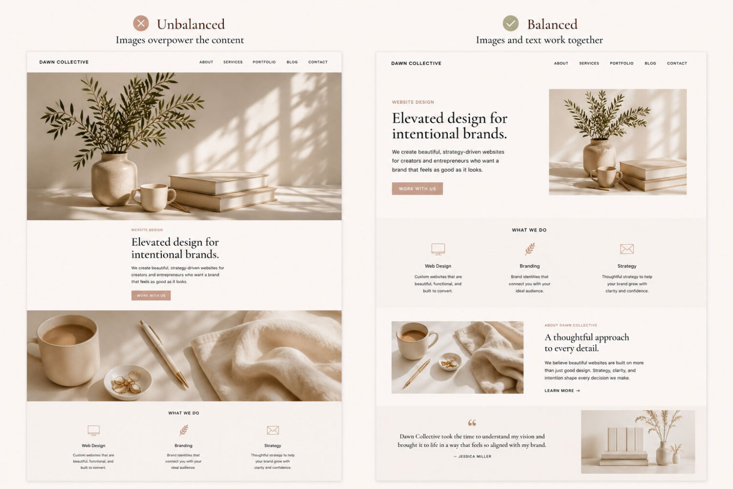
Both layouts use the same images, colors, and typography. The only difference is how the photography is balanced with the surrounding content. Thoughtful spacing allows images to support the story instead of competing with it.
Great design isn’t about making every image bigger—it’s about giving every element the right amount of attention.
06. Common White Space Mistakes to Avoid
Now that you understand why white space matters, it’s just as important to recognize the habits that can make a website feel crowded. Many of these mistakes happen with the best intentions—adding more content, more images, or more sections to provide value. Ironically, those additions often make a page harder to use.
One of the biggest mistakes is trying to fill every available space. Not every corner needs an icon, a button, or another paragraph. Empty space gives visitors a chance to pause, making the content that remains feel more intentional.
Another common issue is inconsistent spacing. A website feels more polished when the distance between headings, paragraphs, images, and sections follows a predictable rhythm. Even small inconsistencies can make a page feel unfinished, even if visitors can’t immediately identify why.
Finally, avoid trying to fit everything “above the fold.” Modern visitors are comfortable scrolling. Rather than squeezing every important element onto the first screen, create a natural flow that encourages them to continue exploring your website.
Avoid This
Try This instead
Design Tip:
Before publishing a page, zoom out and look at the overall layout. If every section is competing for attention, try removing something instead of adding more.

Quick Check:
Before you hit publish, take a minute to ask yourself:
07. Designing for Mobile Without Feeling Crowded
White space becomes even more important on mobile devices, where every inch of screen space matters. While it may be tempting to reduce margins and padding to fit more content on the screen, doing so often has the opposite effect. Crowded mobile layouts feel harder to read and require more effort to navigate.
Instead of shrinking everything, focus on simplifying the experience. Keep paragraphs short, allow generous spacing between touch targets, and avoid stacking too many elements together. Visitors should be able to scroll naturally without feeling overwhelmed.
Remember that mobile visitors interact with your website differently than desktop users. They tap, swipe, and scan quickly. Giving every section enough breathing room makes those interactions feel effortless and encourages visitors to continue exploring your content.
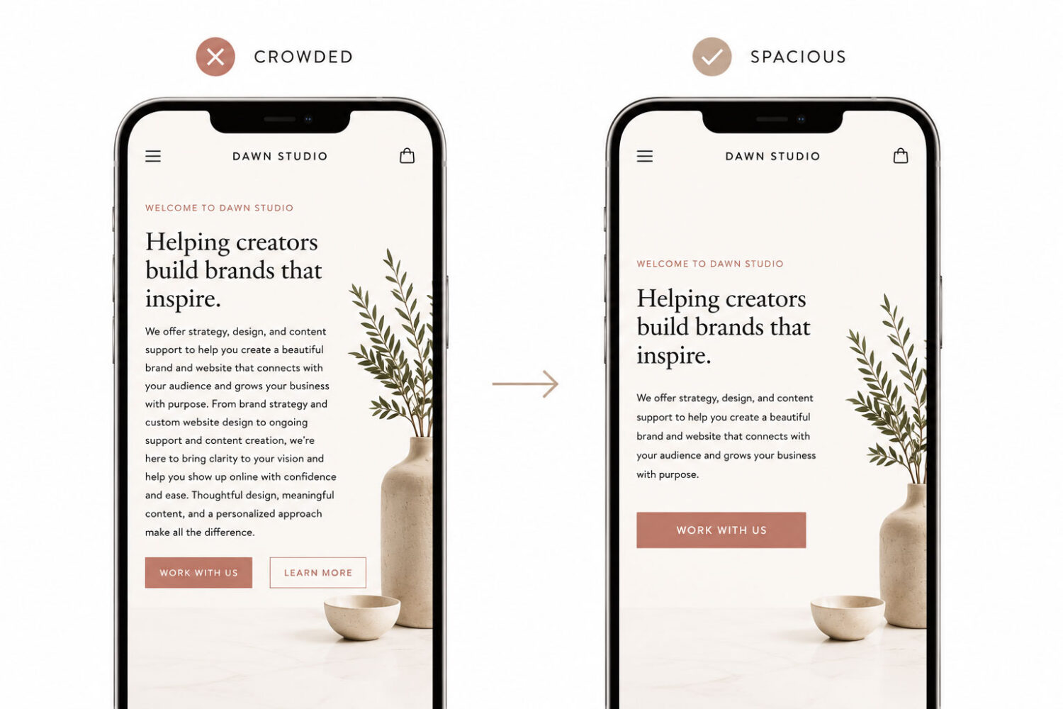
A website doesn’t need to fit more onto a smaller screen—it needs to make every interaction feel easier.
08. Bringing Everything Together
White space isn’t simply a design trend or a minimalist style—it’s one of the most effective tools for creating websites that feel calm, polished, and easy to use. From improving readability to balancing images and guiding visitors through a page, thoughtful spacing influences nearly every part of the user experience.
The best websites don’t try to fill every inch of the screen. Instead, they give each headline, paragraph, image, and button enough room to shine. That balance helps visitors focus on what matters most while creating a website that feels professional from the very first impression.
As you review your own website, resist the urge to ask, “What else can I add?” Instead, ask yourself, “Where could I create a little more breathing room?” Sometimes the smallest design decisions have the biggest impact.
The next time you’re updating your website, resist the temptation to fill every empty space. Instead, step back and look at the page as a whole. The most memorable websites aren’t the ones with the most content—they’re the ones that make every piece of content feel intentional.
Beautiful design isn’t created by adding more—it’s created by making space for what matters most.
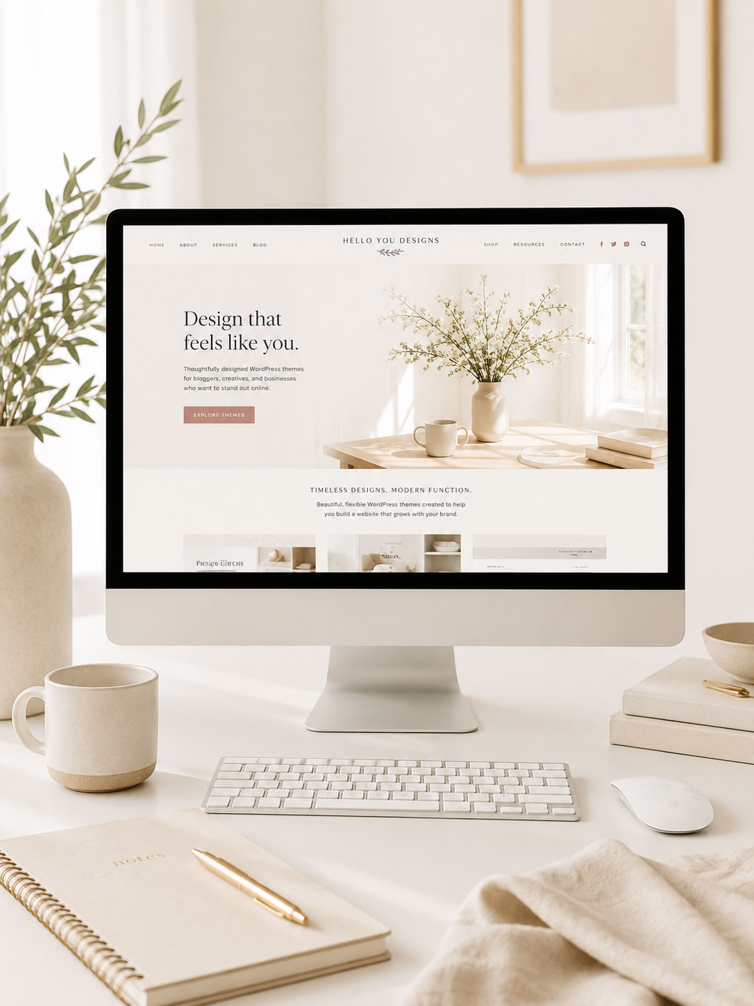
Beautiful Design Starts with Thoughtful Decisions.
Every spacing choice, image, headline, and button contributes to how your website feels. The right WordPress theme gives you a strong foundation, making it easier to create layouts that feel balanced, polished, and effortless from the very beginning.
When the framework is thoughtfully designed, you can spend less time fighting your layout and more time creating content your visitors will love.
Ready to build a website that already follows these principles?
Looking for more website design inspiration? Explore the Hello You Journal for practical tutorials, design tips, and creative ideas.
Some Common Design Questions
Still have questions? Here are a few quick answers to some of the most common questions about this topic.