
Visual Hierarchy: How to Guide Visitors Through Your Website Naturally
10 MIN READ
Great websites don’t just look beautiful, they lead visitors effortlessly from one piece of content to the next. Here’s how visual hierarchy helps every page communicate more clearly.
Have you ever landed on a website and instantly known where to look first?
Maybe your eyes were first drawn to a bold headline, followed by a button inviting you to learn more. From there, you naturally noticed the featured services, testimonials, and contact information without even thinking about it.
That isn’t an accident.
It’s the result of visual hierarchy—one of the most important principles in web design.
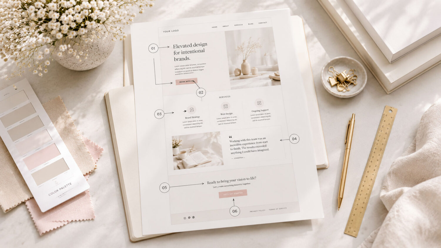
Visual hierarchy determines what visitors notice first—and what they notice next. It helps organize your content, reduce confusion, and create a smoother browsing experience. When used well, it quietly guides people through your website without making them feel overwhelmed.
In this article, we’ll explore what visual hierarchy is, why it matters, and how you can use it to create pages that feel polished, intentional, and easy to navigate.
In This Article
01 What Visual Hierarchy Really Means
02 Why Your Visitors Need Direction
03 Using Size and Scale to Create Emphasis
04 How Spacing Supports Visual Hierarchy
05 Creating Contrast That Guides Attention
06 Building a Clear Reading Path
07 Common Visual Hierarchy Mistakes
08 Bringing Everything Together
01. What Visual Hierarchy Really Means
Imagine walking into a beautifully organized bookstore for the first time.
The largest signs point you toward each section. Featured books are displayed front and center. Smaller shelves hold supporting titles, while tiny labels help you find exactly what you’re looking for.
Well-designed websites work the same way.
Visual hierarchy is simply the order in which visitors notice information. It uses design elements like size, spacing, typography, color, and placement to communicate what matters most.
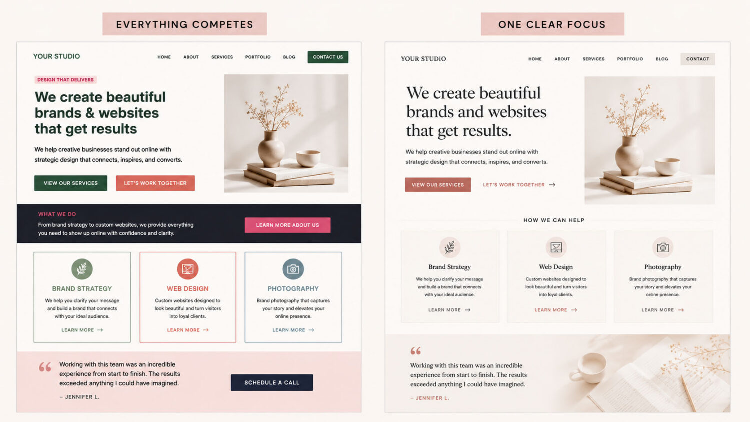
Without hierarchy, every element competes equally for attention. With hierarchy, your content becomes easier to understand and far more enjoyable to browse.
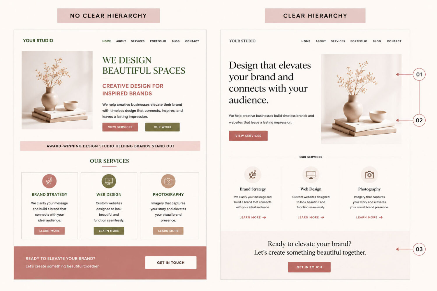
Good design doesn’t make people think about where to look, it simply leads them there.
02. Why Your Visitors Need Direction
People don’t read websites from top to bottom like books.
Instead, they scan.
Within just a few seconds, visitors decide whether your page feels clear enough to keep exploring, or whether they’ll leave. If everything appears equally important, or equally loud, they have to work harder to understand your content.
A clear visual hierarchy removes much of that mental effort.
Instead of asking visitors to figure out where to begin, your design naturally guides them from the headline to the supporting information and finally toward your call to action.
When your layout feels intuitive, people stay longer, engage more, and are more likely to take the next step because your design quietly guides them instead of asking them to figure everything out on their own.
03. Using Size and Scale to Create Emphasis
One of the simplest ways to establish hierarchy is through size.
Larger elements naturally attract attention before smaller ones.
That’s why your main page heading should be the most prominent piece of text. Supporting headings should gradually decrease in size to create a clear reading order, while body text remains comfortable to read.
The same principle applies to photography and buttons. A featured image or primary call to action should stand out—but not overwhelm everything around it.
When every heading is oversized or every button uses the same visual weight, visitors lose the ability to quickly recognize what’s most important.
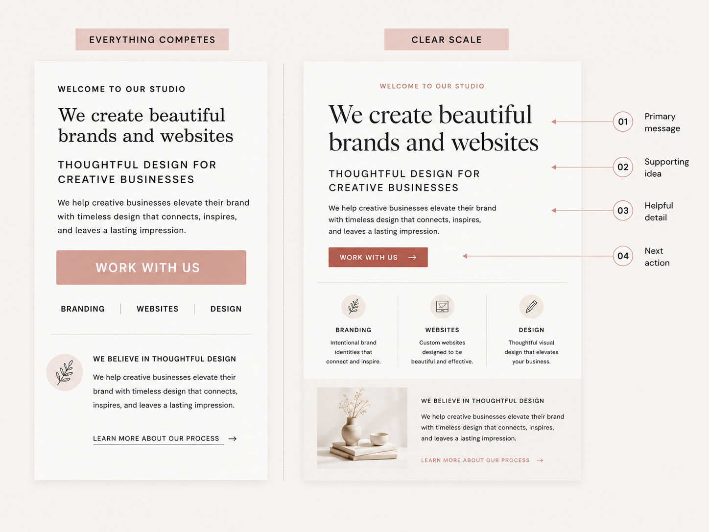
Both examples use the same content, colors, and typography. The difference is how each element is sized. By creating a clear progression from the headline to the supporting information and finally the call to action, the layout immediately becomes easier to scan and understand.

Designer Tip:
Start with one clear focal point on every page. When everything is emphasized, nothing truly stands out.
04. How Spacing Supports Visual Hierarchy
Visual hierarchy isn’t created by size alone—spacing plays an equally important role.
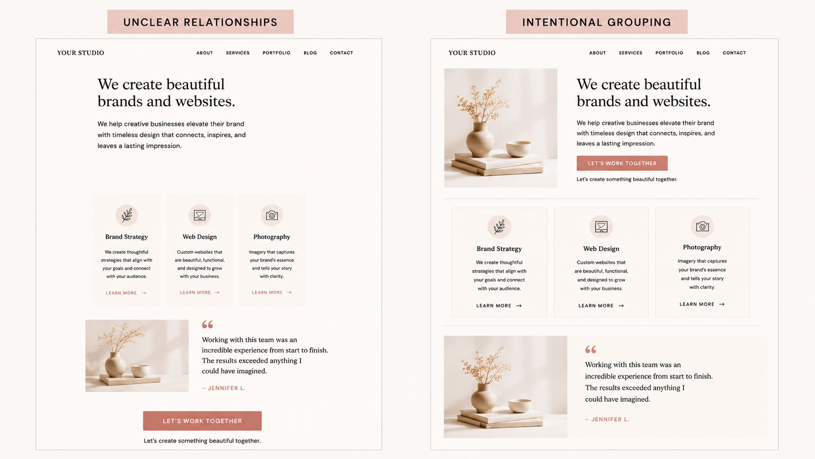
Generous white space separates ideas into clear groups, making your content easier to scan. Sections feel distinct, headlines connect naturally with the paragraphs beneath them, and related content appears intentionally organized.
Without enough spacing, unrelated elements begin to blend together, making the page feel cluttered—even when the content itself is excellent.
Think of white space as invisible organization.
It quietly tells visitors which pieces of information belong together.

Designer Insight:
White space doesn’t just create breathing room—it creates relationships. Elements placed closer together feel connected, while generous spacing signals the beginning of something new.
05. Creating Contrast That Guides Attention
Contrast helps important content stand out—but that doesn’t mean using bright colors everywhere.
Instead, contrast can come from:
Used thoughtfully, contrast gives your page rhythm and helps visitors understand where to focus next. Too much contrast, however, creates competition instead of clarity. When everything demands attention, visitors have a harder time recognizing what actually matters most.
The goal isn’t to make everything noticeable—it’s to make the right things noticeable.
06. Building a Clear Reading Path
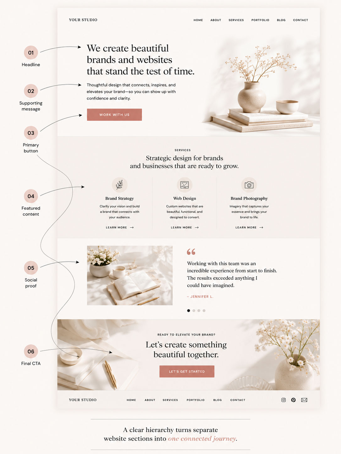
Every page should gently guide visitors through a clear journey.
A typical reading path looks like this:
Headline
↓
Supporting paragraph
↓
Primary button
↓
Key features
↓
Testimonials
↓
Final call to action
When these sections are arranged with a clear visual hierarchy, visitors rarely feel lost. Each section naturally encourages them to keep exploring until they reach your final call to action.
A well-designed website feels effortless because every section naturally leads to the next.
07. Common Visual Hierarchy Mistakes
Even beautiful websites can become difficult to navigate when hierarchy is ignored.
Some of the most common mistakes include:
A little restraint often creates a much stronger design.
Instead of asking every element to compete for attention, decide what deserves to stand out first. Then let everything else support it.

Quick Check:
Before publishing your page, ask yourself:
08. Bringing Everything Together
Visual hierarchy isn’t about following strict design rules. It’s about helping people navigate your website with confidence.
When typography, spacing, contrast, imagery, and layout work together, your website becomes easier to understand and far more enjoyable to explore.
Visitors shouldn’t have to search for what matters.
Great design quietly shows them the way.
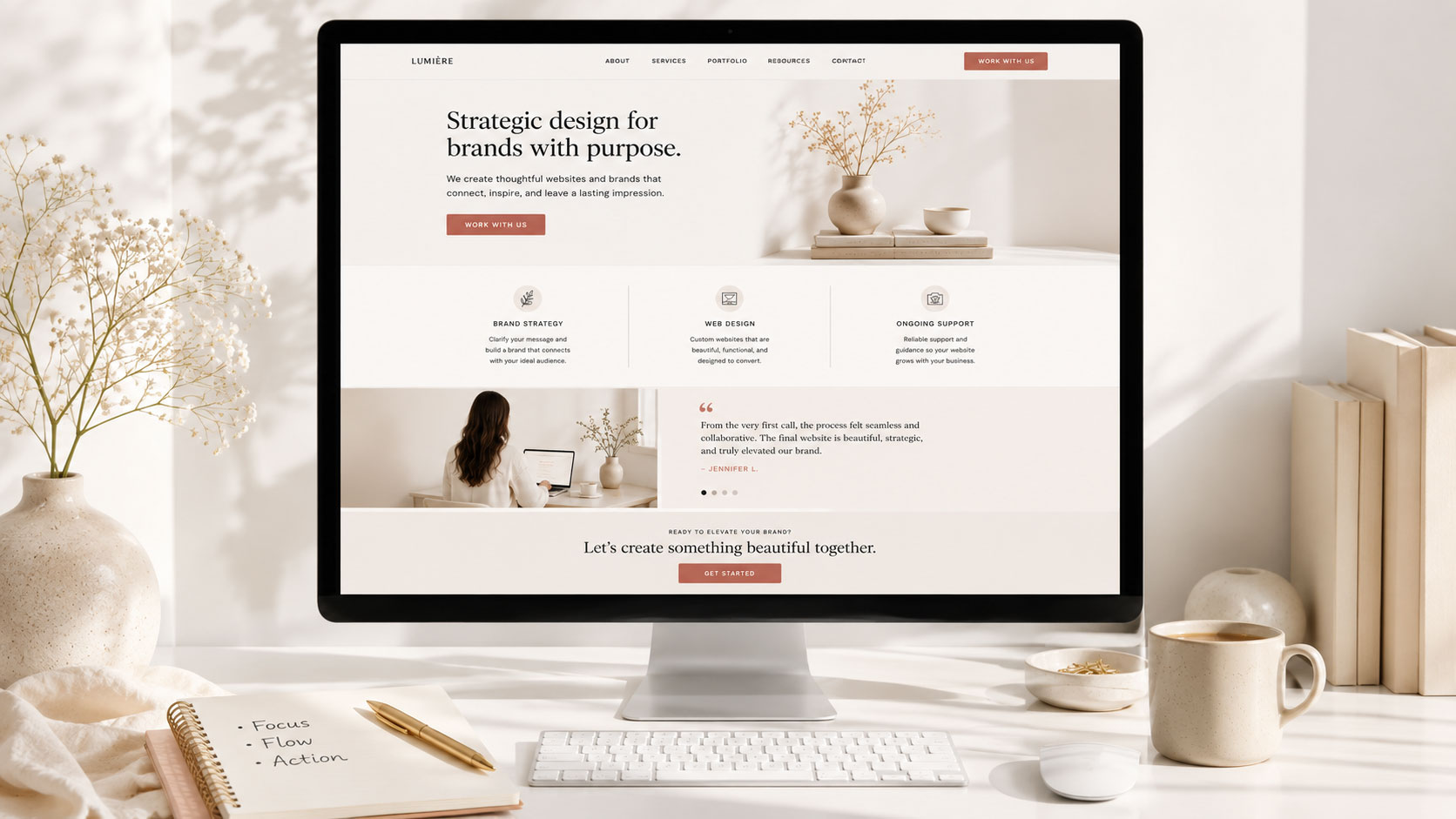
Build a Website That Naturally Guides Your Visitors
Beautiful websites aren’t just visually appealing. They’re thoughtfully organized. Every Hello You theme is designed with clear visual hierarchy, balanced layouts, and intentional spacing to help your content shine and your visitors explore with confidence.
Some Common Design Questions
Still have questions? Here are a few quick answers to some of the most common questions about this topic.