
7 Website Design Mistakes That Make Your Site Look Unprofessional
10 MIN READ
Learn how thoughtful design creates a more polished website.
Beautiful photography and a nice logo aren’t always enough to make a website feel professional.
Often, it’s the small design decisions—the spacing between sections, inconsistent fonts, cluttered layouts, or confusing navigation—that quietly undermine an otherwise beautiful website.
The good news? Most of these mistakes are surprisingly easy to fix.
Whether you’re building your first website or refreshing an existing one, avoiding these common design mistakes can instantly make your website feel more polished, trustworthy, and aligned with your brand.
In This Article
01 Too Much Clutter
02 Inconsistent Typography
03 Weak Visual Hierarchy
04 Too Many Colors
05 Confusing Navigation
06 Ignoring Mobile Design
07 Inconsistent Spacing
08 Final Thoughts
01. Too Much Clutter
One of the fastest ways to make a website feel overwhelming is trying to show everything at once.
When every section competes for attention, nothing stands out.
Instead of filling every inch of the page, prioritize the content that’s most important and give it room to breathe. White space isn’t empty space—it’s one of the most valuable design tools you have.
Simple Ways to Improve It
✓ Remove anything that doesn’t serve a purpose.
✓ Increase spacing between sections.
✓ Let your headlines breathe.
✓ Limit competing calls-to-action.
Great design isn’t about adding more—it’s about knowing what to leave out.
02. Inconsistent Typography
Typography is one of the quickest ways to make a website feel polished—or unfinished. The problem isn’t using multiple fonts. It’s using them without a clear purpose. Every font should have a purpose within your design system.
For example, you might use one font for headings, another for body text, a clean font for navigation and buttons, and a subtle accent font for special details. When those styles remain consistent across every page, your website feels intentional and cohesive.
Visitors shouldn’t have to relearn your design language every time they click to a new page.
Example Typography Pairing — Hello Aster

Heading Font
Your primary display font for page titles and section headings.

Body Font
A clean, highly readable font for paragraphs and longer content.

Nav & Buttons
A consistent font for menus, buttons, and calls-to-action.

Accent Font
An optional decorative font used sparingly to highlight special moments.
03. Weak Visual Hierarchy
Every page should naturally guide a visitor from one section to the next.
When everything looks equally important, readers don’t know where to begin.
Use larger headings, consistent spacing, and intentional layouts to create a natural reading flow.
Good design guides the eye before it asks the brain to think.
04. Too Many Colors
A professional website doesn’t necessarily use fewer colors—it uses colors with intention.
The most cohesive websites rely on a thoughtfully chosen color palette where every shade has a purpose. Instead of picking random colors for each section, buttons, or graphic, build a palette that works together from lightest to darkest.
Neutral tones create balance, accent colors draw attention, and darker shades provide contrast. When every color feels connected, your website naturally feels more polished and memorable.
Primary Brand
Used for your brand’s recognizable elements, including buttons and key calls-to-action.
Supporting Colors
Complementary shades that add depth while maintaining a cohesive look.
Dark Contrast
Used for headings, body text, and strong visual anchors.
Light Neutrals
Used for backgrounds, cards, spacing, and allowing content to breathe.
Accent Color
Used sparingly to highlight important details and add personality.
A well-designed website doesn’t rely on just a few colors—it relies on colors that are intentionally chosen to work together.
Example Palette — Hello Aster
#4D3533
Palette 1
#AC8866
Palette 2
#AD988B
Palette 10
#171A1A
Palette 3
#4A4A4A
Palette 4
#A4A3A3
Palette 5
#D5C7BE
Palette 6
#F4EAE1
Palette 7
#FDFAF9
Palette 8
#C08685
Palette 11

Quick tip:
When choosing colors, start with one favorite color and build the rest of your palette around it. Lighter and darker variations of the same tones often create a more cohesive website than introducing completely unrelated colors.
05. Confusing Navigation
If visitors can’t find what they’re looking for quickly, they’ll leave. Your navigation should answer one question:
“Where should I click next?”
Keep menus concise and organize content into logical categories.
06. Ignoring Mobile Design
A website that looks beautiful on your desktop can feel completely different on a phone.
Large headings may wrap awkwardly, images can become cropped, buttons may be difficult to tap, and sections that felt balanced on a large screen can suddenly feel cramped.
Before publishing a page, always preview it on desktop, tablet, and mobile. Small adjustments to spacing, typography, and image placement can make a significant difference in how polished your website feels.
Designer Tip:
Don’t just make your website fit on a phone—make sure it’s enjoyable to use there. Scroll through every page as if you were a first-time visitor. Can you easily read the text, tap the buttons, and find what you’re looking for?
07. Inconsistent Spacing
Consistent spacing is one of the quiet details that makes a website feel polished.
When every section has different amounts of padding, images sit too close together, or buttons feel randomly placed, visitors may not know exactly what’s wrong—but they’ll notice that something feels off.
Giving your content room to breathe creates rhythm, improves readability, and helps guide visitors naturally through the page.
Designer Tip:
Don’t measure one section at a time. Instead, choose a spacing system and repeat it consistently throughout your website.
Final Thoughts
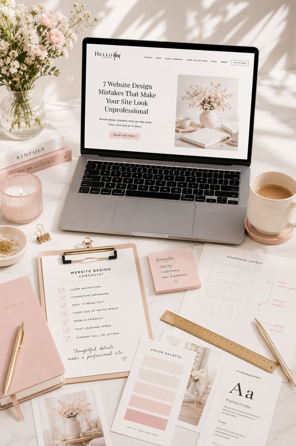
Professional websites aren’t created through expensive software or endless customization.
They’re built through thoughtful, consistent decisions.
Small improvements—better spacing, consistent typography, clear navigation, and intentional branding—add up to a website that feels trustworthy, polished, and uniquely yours.
If you focus on creating a better experience instead of simply adding more features, your website will naturally begin to feel more professional.
Ready to Put These Tips Into Practice?
If you’re starting a new website—or refreshing an existing one—a thoughtfully designed foundation makes every decision easier.
Every Hello You Designs theme is built with intentional typography, cohesive color palettes, responsive layouts, and flexible designs that help your website feel polished from day one.